Prepare Data
Before you begin, ensure your data is as ready as possible to make it easier for a model to identify meaningful trends. We recommend you use the data cleaning tools in DataChat to make sure your data satisfies our best practices before attempting to train a model.
Visualize Data
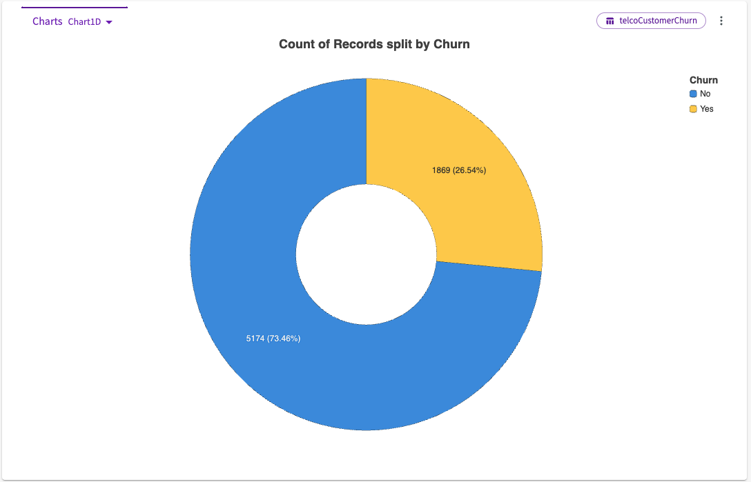
The Visualize skill helps you get a picture of your data. It uses a generative chart building algorithm that uses the columns in your dataset to create charts that let you examine your data from different angles.
To use Visualize:
- Click Machine Learning > Visualize in the skill menu.
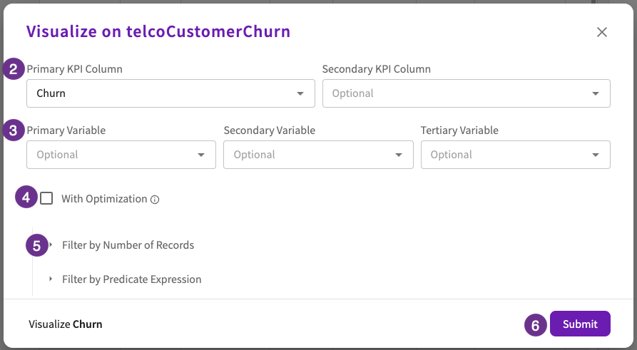
- Select at least one key performance indicator (KPI) as a dependent column. Optionally, select another KPI.
- Optionally, select at least one variable as the independent column to use to visualize the dependent column. Optionally, select up to two other variables.
- Optionally, select the With Optimization checkbox to use machine learning to identify impactful features and create charts based on those findings.
- Optionally, select whether you'd like to filter by number of records or filter by a predicate expression.
- Click Submit.
The chart appears in the Chart tab. Use the dropdown menu on the right side of the chart header to switch between different chart options.