Create Charts
Charts can help you explore your data, visualize your findings, and share insights with others.
Before you get started, DataChat recommends:
- Renaming the columns you want to use in your visualizations so that they have short, easy-to-read names.
- Making sure any time-based columns are placed on the X axis.
Create a New Chart
To create a new chart, you can either click Plot Chart in the Data tab, or click New Chart by hovering over the Chart tab. Both options open the Chart Builder.

You can also use the Data Assistant to create charts for you.
Chart Builder
The Chart Builder is an interactive interface that helps you create and customize in-depth visualizations. The components of the Chart Builder include:
- Chart Types
- Required Fields
- Optional Fields
- Dataset Sample Limit
- Filters
- Customize
- Data Sample
- Describe
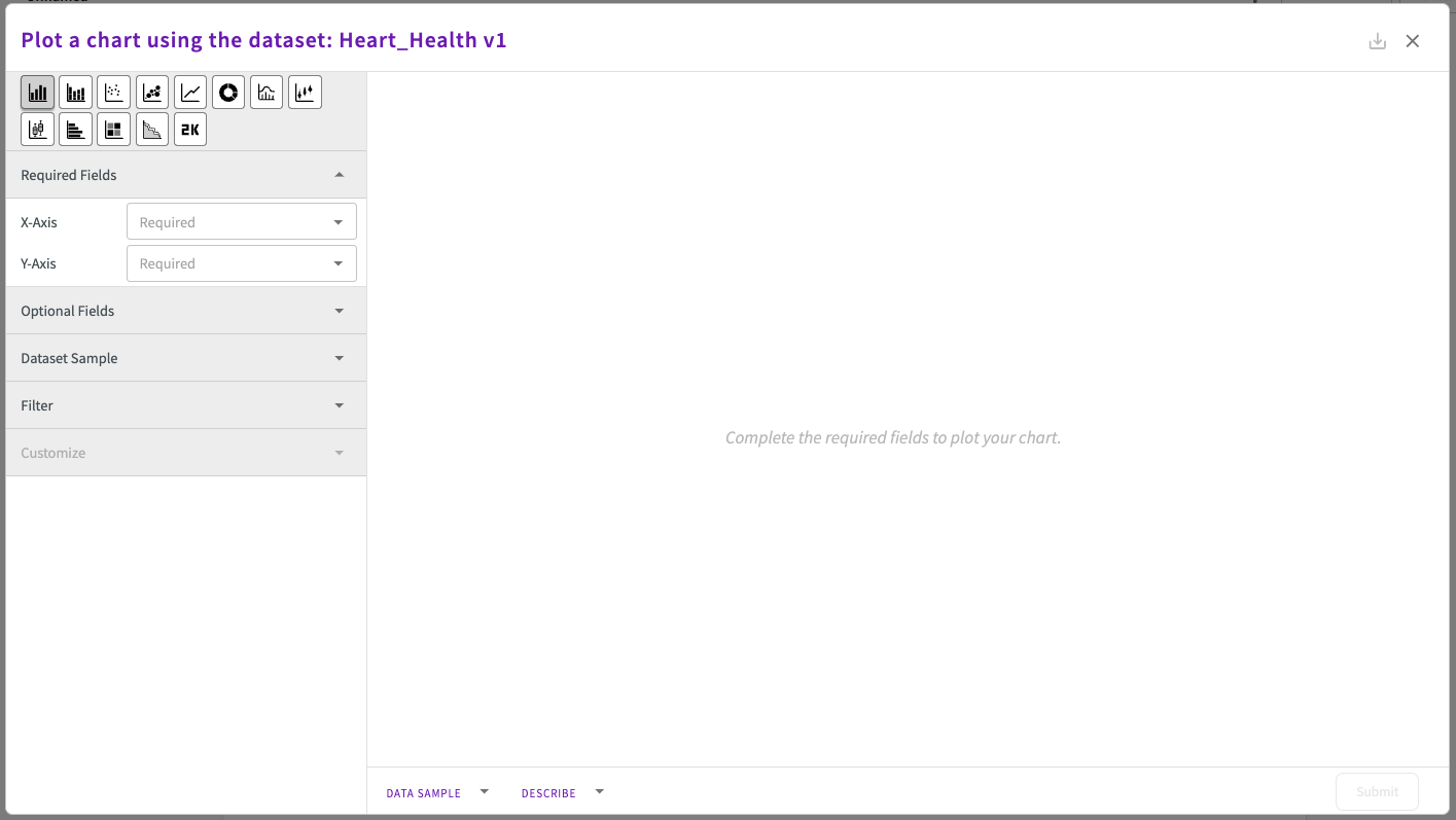
Chart Types
Select a chart type icon to build a chart.

From left to right:
- Bar Chart: Displays categorical data with rectangular bars proportional to their values.
- Stacked Bar Chart: Breaks down and stacks categorical data in a single bar per category.
- Scatter Chart: Plot of individual data points to reveal relationships between two variables.
- Bubble Chart: Visualizes relationships between three variables using X and Y positions, and bubble size.
- Line Chart: Tracks data trends over time or across categories with a continuous line.
- Donut Chart: Highlights proportional data as a circular chart with a blank center.
- Histogram: Shows data distribution by grouping values into bins as vertical bars.
- Violin Chart: Combines box plots and density curves to show data distribution and variability.
- Box Chart: Summarizes data distribution with quartiles and outliers in a compact box-and-whisker format.
- Horizontal Bar Chart: Displays categorical data with horizontal bars proportional to their values.
- Heatmap: Represents data intensity with color gradients in a grid layout.
- Stacked Area Chart: Visualizes cumulative trends with layers of shaded areas.
- Single Metric Chart: Highlights a key value or KPI for quick reference.
Required Fields
The required fields change to fit each chart type.
| X-axis | Y-axis | Column | Bubble Size | Split | Density | Partition | Slice Size | |
|---|---|---|---|---|---|---|---|---|
| Bar | ✔️ | ✔️ | ||||||
| Box | ✔️ | ✔️ | ||||||
| Bubble | ✔️ | ✔️ | ✔️ | |||||
| Donut | ✔️ | ✔️ | ||||||
| Heatmap | ✔️ | ✔️ | ✔️ | |||||
| Histogram | ✔️ | |||||||
| Horizontal Bar | ✔️ | ✔️ | ||||||
| Line | ✔️ | ✔️ | ||||||
| Single Metric | ✔️ | |||||||
| Scatter | ✔️ | ✔️ | ||||||
| Stacked Area | ✔️ | ✔️ | ||||||
| Stacked Bar | ✔️ | ✔️ | ✔️ | |||||
| Violin | ✔️ | ✔️ |
- X-axis and Y-axis. The column whose values populate each axis.
- Optionally, you can click on the column name after selecting it to apply a bin (usually the x-axis) or aggregate (usually the y-axis) to the column. If no aggregate is specified:
- For bar, scatter, horizontal bar, bubble, line, stacked bar, and single metric charts, the average value is used.
- For stacked area charts, the total value is used.
- For all other charts, no default aggregate is used.
- Optionally, you can click the gear icon next to the each axis to configure axis minimums and maximums.
- Optionally, you can click on the column name after selecting it to apply a bin (usually the x-axis) or aggregate (usually the y-axis) to the column. If no aggregate is specified:
- Column. The column whose metric (such as average, total, count of records) to display.
- Bubble size. The column whose values determine the size of each bubble.
- Split. The column whose values populate the donut chart. Optionally, you can click on the column name after selecting it to apply a bin to the column.
- Density. The column whose values populate the cells of the heatmap.
- Partition. The column whose values divide the values of each bar into stacks.
- Slice Size. The column values, grouped by the Split column, to use to create the chart's slices. Optionally, you can click on the column name after selecting it to apply an aggregate to the column. By default, count of records is applied.
Once you enter the required values, a preview of the new chart appears in the chart display. You can adjust values to view changes in real time before you click Submit and continue with your DataChat session.
Optional Fields
The optional fields change to fit each chart type and allow you to tune and detail your visualizations.
| Color | Group | Label | Overlay | Slider | Smooth | Split | Subplot | |
|---|---|---|---|---|---|---|---|---|
| Bar | ✔️ | ✔️ | ✔️ | ✔️ | ||||
| Box | ✔️ | ✔️ | ||||||
| Bubble | ✔️ | ✔️ | ✔️ | ✔️ | ||||
| Donut | ✔️ | ✔️ | ||||||
| Heatmap | ✔️ | ✔️ | ||||||
| Histogram | ✔️ | ✔️ | ||||||
| Horizontal Bar | ✔️ | ✔️ | ✔️ | ✔️ | ||||
| Line | ✔️ | ✔️ | ✔️ | ✔️ | ✔️ | |||
| Scatter | ✔️ | ✔️ | ✔️ | ✔️ | ||||
| Single Metric | ✔️ | ✔️ | ||||||
| Stacked Area | ✔️ | ✔️ | ✔️ | |||||
| Stacked Bar | ✔️ | ✔️ | ||||||
| Violin | ✔️ | ✔️ | ✔️ |
- Color. The column whose values specify a color for each bubble.
- Group. The column whose values group each data point by each unique value.
- Label. The column whose values add a label above each point or bubble.
- Overlay. The column whose values populate an overlay (a second y-axis) on top of the existing chart.
- Slider. The column whose values create slider sections.
- Smooth. Determines whether the line is smoothed out from point to point.
- Split. The column whose values group the chart into sections. The column must include exactly two distinct values, such as "True" and "False".
- Subplot. The column whose values create separate plots for each unique value.
Once you enter the optional fields, view the chart display to check your work. You can adjust values to view changes in real time before you click Submit and continue with your DataChat session.
Dataset Sample Limit
The Row Limit field in the Dataset Sample section allows you to specify the number of rows from your dataset to use as sample when plotting a chart. This helps to generate charts more quickly, especially when working with large datasets. By default, the Chart Builder automatically samples the first 15,000 rows.

Filter
You can use Filters to define expressions to limit the data shown in your chart.
Once you enter the filter parameters, click Apply. The labeled filter appears. Multiple filters can be added to a single chart. Saved filters can be removed by editing the chart in the Chart Builder and clicking the X on the labeled filter. You can also enable or disable a filter by clicking on it. The background of enabled filters is blue, while the background of disabled filters is gray.
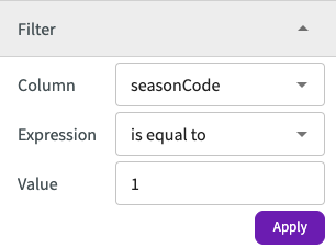
Filtering with date or time types is currently not supported.
Customize��
The customize fields change to fit each chart type and allow change the way your chart appears:
| Axes | Labels | Font Sizes | Plot | Annotations | |
|---|---|---|---|---|---|
| Bar | ✔️ | ✔️ | ✔️ | ✔️ | ✔️ |
| Box | ✔️ | ✔️ | ✔️ | ✔️ | ✔️ |
| Bubble | ✔️ | ✔️ | ✔️ | ✔️ | ✔️ |
| Donut | ✔️ | ✔️ | ✔️ | ||
| Heatmap | ✔️ | ✔️ | ✔️ | ✔️ | |
| Histogram | ✔️ | ✔️ | ✔️ | ✔️ | ✔️ |
| Horizontal Bar | ✔️ | ✔️ | ✔️ | ✔️ | ✔️ |
| Line | ✔️ | ✔️ | ✔️ | ✔️ | ✔️ |
| Scatter | ✔️ | ✔️ | ✔️ | ✔️ | ✔️ |
| Single Metric | ✔️ | ✔️ | |||
| Stacked Area | ✔️ | ✔️ | ✔️ | ✔️ | ✔️ |
| Stacked Bar | ✔️ | ✔️ | ✔️ | ✔️ | |
| Violin | ✔️ | ✔️ | ✔️ | ✔️ |
- Axes. Clicking the toggle enables autoscaling of charts.
- Labels. The chart title, X-axis and Y-axis labels, prefixes and suffixes for X-axis and Y-axis ticks (except for donut, heatmap, and single metric charts), and captions.
- Font Sizes. The size of font for all of your labels, or individual labels.
- Plot. The color to make your plot points.
- Annotations. Add aggregate lines (such as maximum, minimum, or average), add text, or annotations.
Data Sample
Click the arrow next to Data Sample to reveal a table that displays a small sample of the dataset.
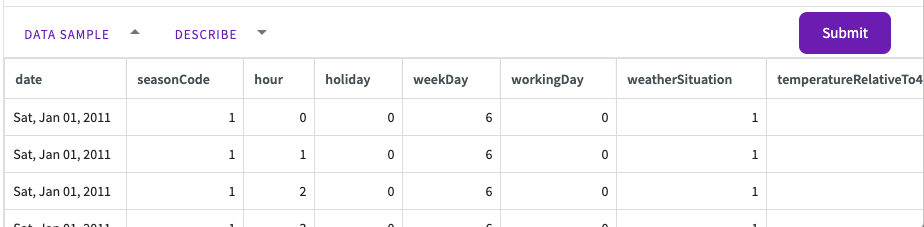
If the chart is edited from an Insights Board, the data sample is unavailable.
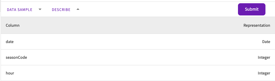
Describe
Click the arrow next to Describe to reveal a table that displays each column and its type. The table is a summary of Describe.
Skill Form
Some chart types are only available using the Skill form. Alongside the chart types available in the Chart Builder, the Plot skill also offers the following chart types:
- Correlation Matrix
- Geomap
- Hybrids
- Multi-axis Bar and Horizontal Bar
- Parallel Coordinates
- Ridgeline
- Sunburst
- Treemap
To use the Skill form to create your chart:
- Click Skill in the skill menu.
- Enter
Plotand select the plot, chart, graph, or matrix you want to create. - Use the autocomplete suggestions to configure your axes, sliders, and any other options you need to complete your chart.