Create a Model
Before you begin, make sure you've read our Best Practices for machine learning.
Introduction
The Train Model skill handles many of the complicated aspects of machine learning, such as feature identification and removal (known as "pruning"), data optimization (such as binning continuous values), and more. Using the Train Model skill also helps to build specific types of models or can provide more granular control over how the model is trained.
By default, DataChat automatically explores multiple models and selects the optimal one for you. If the initial model has a low score, DataChat will continue to evaluate additional models across various types. Alternatively, you have the flexibility to choose and configure specific models to suit your particular requirements.
Build a Model
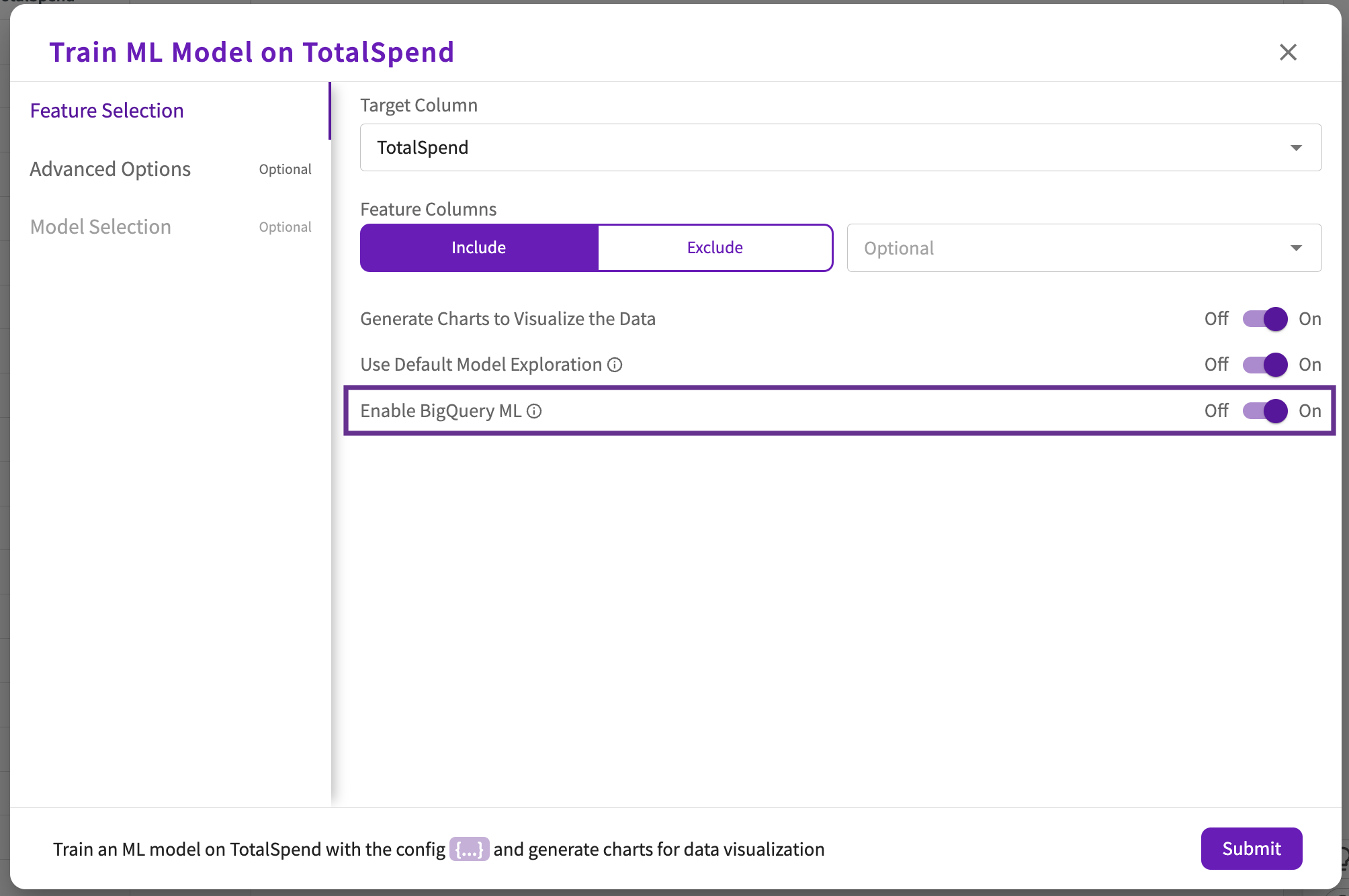
To create model, click Machine Learning > Train Model in the skill menu, then:
If you're connected to a BigQuery database, you can leverage BigQuery ML within DataChat.
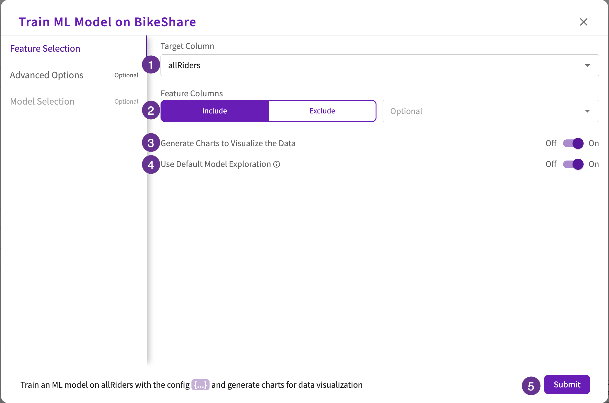
Feature Selection (required)
- Choose your target column.
- Optionally, include or exclude specific feature columns from the model. By default, if no columns are selected, all other columns will be used as feature columns.
- Optionally, toggle Generate charts to Visualize the Data depending on whether you want to generate charts based on the created model. By default, this toggle is on.
- Optionally, toggle the Use Default Model Exploration. By default, Catboost and LightGBM models will be explored. If neither of these models preform well, Random Forest and logistic/linear regression models will be explored.
- Click Submit or continue to Advanced Options.
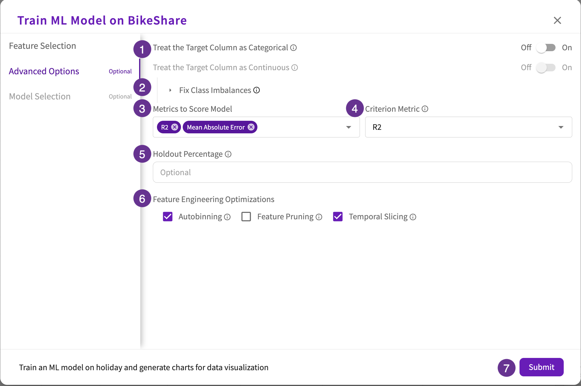
Advanced Options (optional)
-
Depending on the target column type, differing toggle options appear:
- For continuous target columns, toggle the Treat the Target Column as Categorical to change the problem type to classification.
- For categorical target columns, toggle the Treat the Target Column as Continuous to change the problem type to regression. Note that only numerical columns enable this toggle.
-
Click Fix Class Imbalances to open a multi-toggle dropdown that includes:
- Oversampling. Toggle "On" to oversample underrepresented values in the training dataset.
- Automatic Label Weighting. Toggle "On" to assign relative importances to target column values.
- Custom Label Weighting. Toggle "On" to provide custom weights to target column values.
-
Select the metrics to use when scoring the model. Regression models have the following scoring options:
- Mean Absolute Error.
- Mean Absolute Percentage Error.
- Mean Squared Error.
- R2.
- Root Mean Squared Error.
Classification models have the following scoring options:
- AUC.
- Accuracy.
- F1.
- Log Loss.
- Precision.
- Recall.
-
Select the metric to use when selecting the best model.
-
Enter the holdout percentage to use for holdout validation.
-
Feature Engineering Optimizations includes the following checkboxes:
- Autobinning (tree based models). Check this box to automatically bin continuous feature columns.
- Feature Pruning. Check this box to automatically prune unimportant feature columns.
- Temporal Slicing. Check this box to automatically slice temporal feature columns.
-
Click Submit or continue to Model Selection.
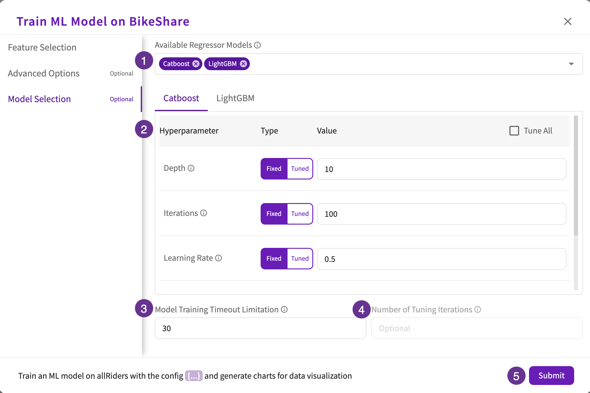
Model Selection (optional)
Model Selection is only available if "Use Default Model Exploration" is toggled "Off".
- Select the classifier or regressor models to use in training.
- Select the hyperparameter types and values for each selected model. Optionally, you can also select the Tune All checkbox to turn on hyperparameter tuning for all hyperparameters with default ranges and steps:
| Catboost | Decision Tree | KNN | LightGBM | Linear Regression | Linear SVC | Linear SVR | Logistic Regression | Random Forest | Support Vector | XGBoost | |
|---|---|---|---|---|---|---|---|---|---|---|---|
| Bagging Fraction | ✔️ | ||||||||||
| Bagging Frequency | ✔️ | ||||||||||
| Degree | ✔️ | ||||||||||
| Depth | ✔️ | ||||||||||
| Iterations | ✔️ | ||||||||||
| Fit Intercept | ✔️ | ✔️ | |||||||||
| Kernel | ✔️ | ||||||||||
| Learning Rate | ✔️ | ✔️ | |||||||||
| L2 Regularization | ✔️ | ||||||||||
| Max Depth | ✔️ | ✔️ | ✔️ | ✔️ | |||||||
| Min Data in Leaf | ✔️ | ||||||||||
| Min Samples Leaf | ✔️ | ✔️ | |||||||||
| Number of Estimators | ✔️ | ✔️ | |||||||||
| Number of Iterations | ✔️ | ||||||||||
| Number of Leaves | ✔️ | ||||||||||
| Number of Neighbors | ✔️ | ||||||||||
| Penalty | ✔️ | ✔️ | |||||||||
| Random Strength | ✔️ | ||||||||||
| Solver | ✔️ |
If you selected "Tuned" for any of the hyperparameter types:
- Enter the maximum time allowed (in minutes) for training the selected models.
- Enter the number of tuning iterations to find the best hyperparameter combinations.
- Click Submit.
BigQuery ML
For information on BigQuery ML permissions, refer to Database Types.
If your dataset came from a BigQuery connection, you can optionally toggle the Enable BigQuery ML option under Feature Selection, which is enabled by default for BigQuery datasets. When enabled, DataChat leverages BigQuery ML to train models.
By default, DataChat explores BigQuery Logistic/Linear Regression and BigQuery XGBoost models. Optionally, you can select the BigQuery classifier or regressor models to use in training and specify their hyperparameter types and values under Model Selection:
| BigQuery Deep Neural Network | BigQuery Linear Regression | BigQuery Logistic Regression | BigQuery Random Forest | BigQuery Wide and Deep Network | BigQuery XGBoost | |
|---|---|---|---|---|---|---|
| Activation Function | ✔️ | ✔️ | ||||
| Batch Size | ✔️ | ✔️ | ||||
| Learning Rate | ✔️ | |||||
| L1 Regularization | ✔️ | ✔️ | ||||
| L2 Regularization | ✔️ | ✔️ | ||||
| Max Depth | ✔️ | ✔️ | ||||
| Min Samples Leaf | ✔️ | |||||
| Number of Estimators | ✔️ | ✔️ | ||||
| Optimizer | ✔️ |
Outputs
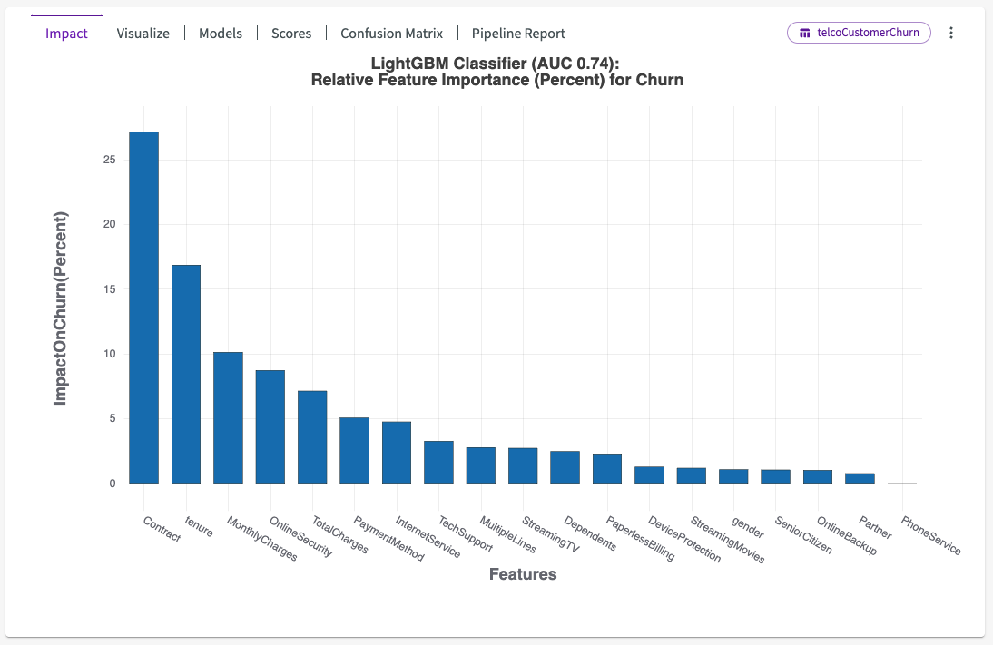
When Train Model is finished, an impact chart appears in the Chart tab. It provides a number of important results that can be found in the chart header.
Impact
DataChat selects a winning model and is given the name “BestFit1”. Subsequent models created by Train ML Model are named “BestFit2”, “BestFit3”, and so on. You can Save this model to be used on future data, using the Skill form.
DataChat also produces an impact chart, which illustrates the average impact each input feature has on the target feature. The features are sorted from most-impactful to least-impactful.
To obtain the impact scores for each feature as displayed on the bar chart, we first calculate the Shapley values for each feature for each sample in the training dataset. From these "local Shapley scores", we take the absolute values and then average them for each feature over all the individual data samples. These values are then displayed in the bar chart as the feature-wise model impact scores. For more information on Shapley values, see this article.
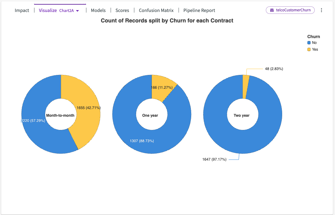
Visualize
Train Model also provides several visualizations that can help illustrate the trends identified by the model. These charts can help you understand your data, show trends for impactful features, and help catch errors in your data that could be affecting your models. Use the dropdown next to Visualize to view different generated charts.
Models
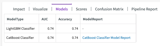
The Models section of the output contains four sections:
- ModelType. The model that was used in training.
- A set of scores generated for all the trained models.
- ModelReport. If the candidate model used has a model report, you can click the link to explore the candidate model's scores and pipeline report.
Scores
Different model scores are used for different model types, by default:
- Regression models are given an R2 score, which can be interpreted as the percentage of the data that fits the model's trend. Whether the score is good or bad is highly dependent on the model's use case.
- Classification models use a few different scoring methods, but AUC is the primary one. If label weighting was used or detailed model scores were requested, AUC is replaced (or complemented) with a F1 score. It represents the "precision" of the model (# of true positives / # of true positives + # of false positives) divided by the model's "recall" (# of true positives / # of true positives + # of false negatives).
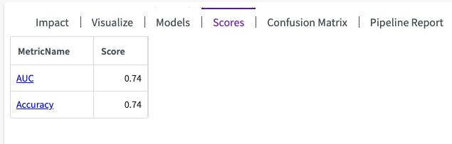
Scores will depend on which scoring metrics are selected in the Train ML Model form.
Residual or Confusion Matrix Plots
Residual Plots
For regression models, a residual plot can help you investigate whether your model is a strong one. A residual value is the difference between the actual value and the predicted value of a given data point. A residual plot places all of your residual values around the horizontal axis, which represents the model’s line of best fit.
If your residual values follow a normal distribution and are centered around the zero residual line, then your dataset is well-suited for linear regression.
A Best Fit Line will appear as a residual plot option when the best fit model is a DataChat linear regression model with a single feature.
A Normal QQ Plot will appear as a residual plot option when the best fit model is either a BigQuery linear regression or a DataChat linear regression model.
Confusion Matrix Plots
For classification models, a confusion matrix helps investigate the performance of the model. A confusion matrix compares how well the model’s predicted values match the actual values in the dataset.
The actual values are placed on the Y axis, while the predicted values are placed on the X axis. Each section represents the percentage of values that satisfy each case where the predicted value was X and the actual value was Y. In the example below, our model had:
- 20% of samples predicted as 0 had an actual value of 1
- 80% of samples predicted as 1 had an actual value of 1
- 97% of samples predicted as 0 had an actual value of 0
- 3% of samples predicted as 1 had an actual value of 0
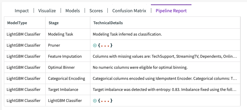
Pipeline Report
The pipeline report shows detailed information about each step of the model training process (known as a “pipeline”). From this report, you can see important information from each step of the model training process, including which features were pruned, what features were used, the edges of any automatically-created bins, and more.