Guided Learning
This section explores training models in DataChat using telecommunications contract data.
Load Our Data
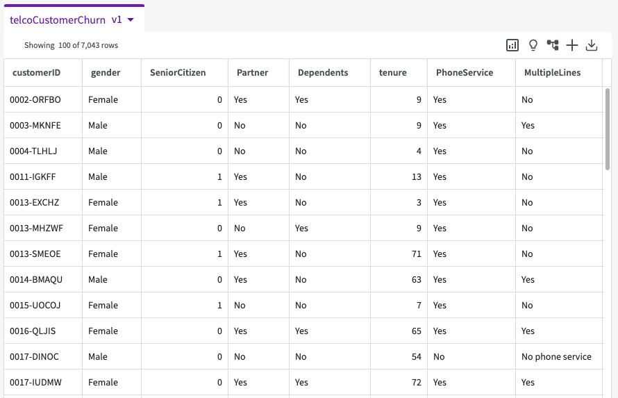
To start, Load the provided demo dataset, telcoCustomerChurn, into the session. We're then given a sample of our dataset that looks something like this:
Describe Our Data
Let's get a better understanding of the data we're working with by clicking Show Descriptive Statistics in the dataset header.
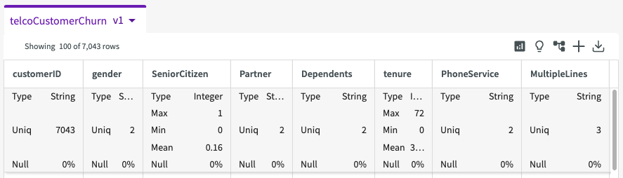
Each column now provides some summary statistics about our data, including column types, unique counts, minimum and maximum values, and more.
We see that the target feature is the "Churn" column, meaning that it is influenced by the other columns in the dataset. We can see that the target column has two unique values, "yes" and "no". The column "CustomerID", on the other hand, has 7043 different values.
From here, let's dive a bit deeper into the "Churn" column. Click the More menu > Describe in the churn column. This creates a donut chart breaking down the number of records for each unique value.
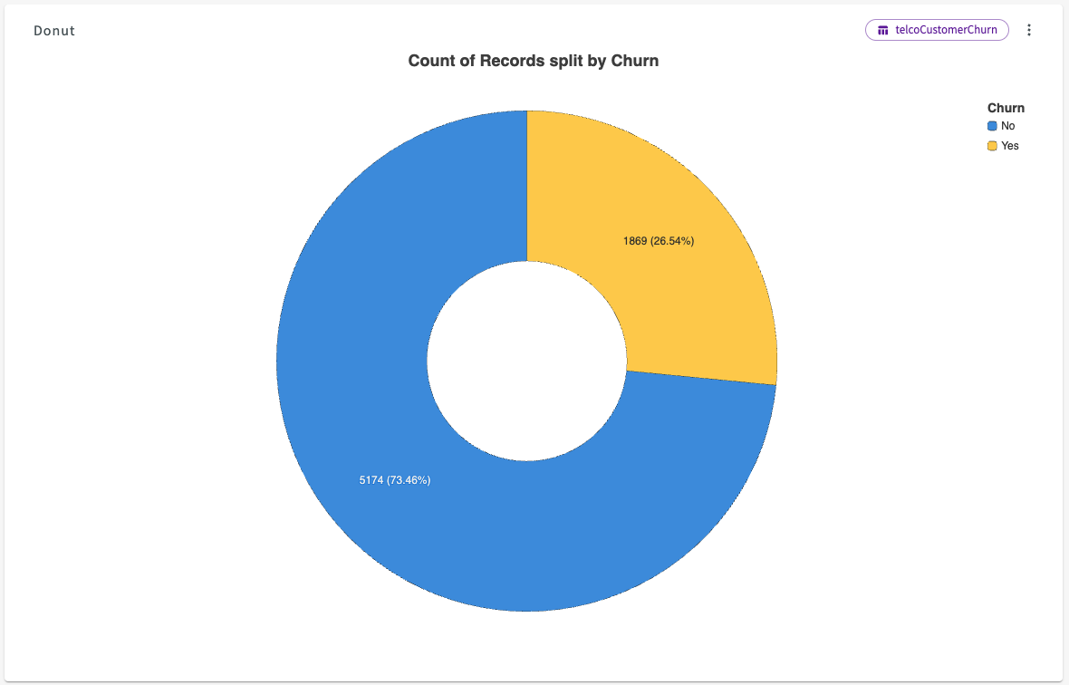
We can see that 73.46% of contracts do not churn, while 26.54% of contracts do.
Investigate Target Column
Now that we've explored our data, we can use the Data Assistant to do some preliminary investigation of the factors that most impact whether or not a customer churns.
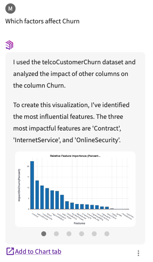
Navigate back to the Data tab, then ask the Data Assistant "Which factors affect Churn".
After completing this process, it provides a feature importance chart that visualizes how each column in the dataset affects the target column, "Churn," in the conversation history:
Click Add to Chart tab.
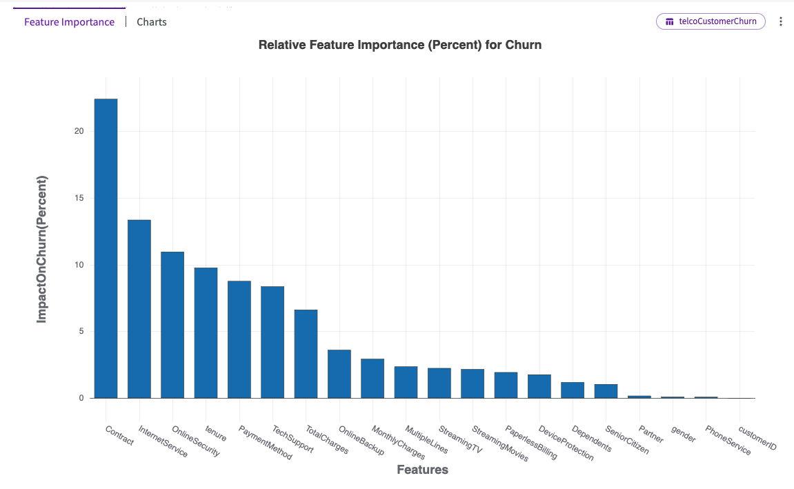
Hover over each bar in the chart to view more details. We can see that "Contract" followed by "InternetService" have the most impact on "Churn".
From here, we can click Charts in the chart header. This provides a dropdown of different auto-generated charts that visualize the most impactful columns. By default, Visualize opens with Chart1A, in this case a series of donut charts displaying the churn ratios for each contract type across internet services.
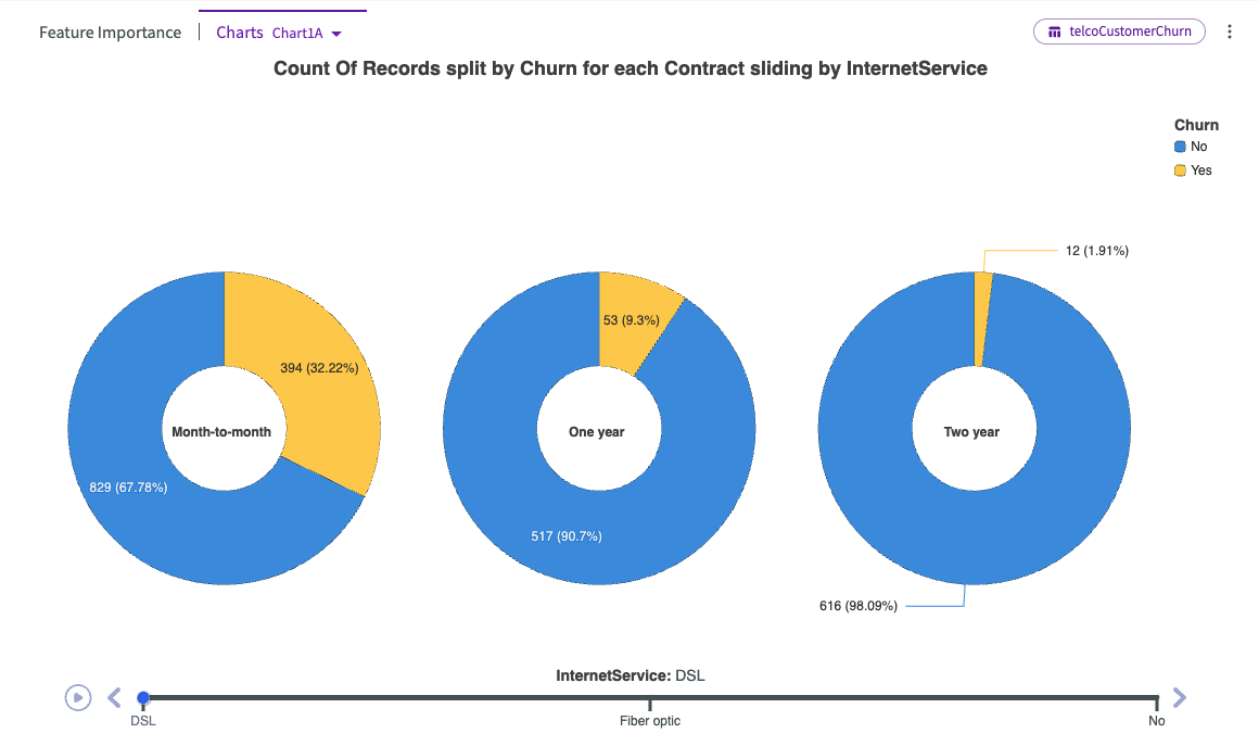
We can see that across all internet service types, month-to-month contracts have the highest churn, while one-year and two-year contracts tend to have substantially less churn.
Let's click the Charts dropdown and select Chart1B.
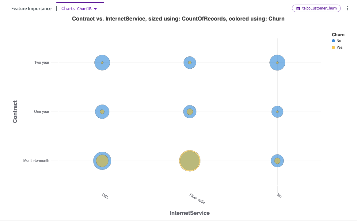
This bubble chart offers an alternative visualization of the relationship between contracts, internet service types, and churn rates. Notably, the highest churn ratio occurs with month-to-month contracts, particularly for fiber optic service, where the number of customers churning exceeds those who stay.
Train the Target Column
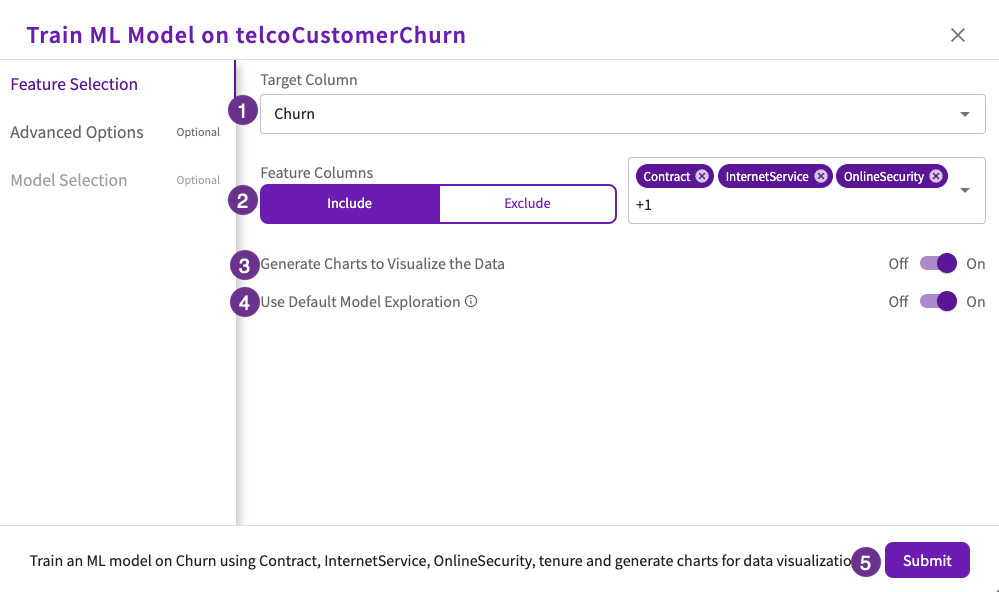
Let's get more granular with our investigation by building a machine learning model using the four most impactful columns ("Contract", "InternetService", "OnlineSecurity", and "tenure") from our initial feature importance chart.
Create a Model
Navigate back to the Data tab, click Machine Learning > Train Model from the skill menu, then:
- Select "Churn" for the target column.
- Select "Contract", "InternetService", "OnlineSecurity", and "tenure" for the feature columns to include.
- Set Generate Charts to Visualize the Data toggle to "On".
- Set Use Default Model Exploration toggle to "On".
- Click Submit.
DataChat trains multiple models and chooses the one that best predicts the impact of other columns on the target column. Once complete, the impact chart is automatically displayed in the Chart tab:
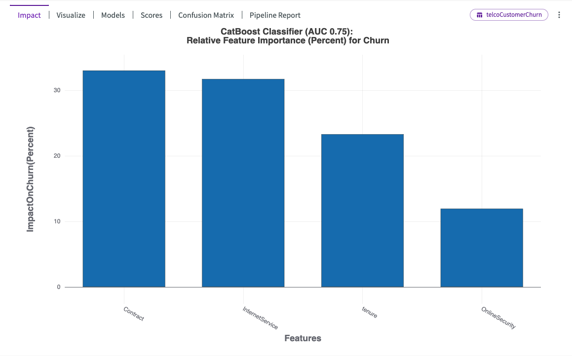
This impact chart differs from our feature importance chart by showing that contract type and internet services have a more comparable influence on churn. Additionally, it reveals an increased impact of tenure.
Models Scores and Pipeline Report
Let's investigate the models used in training. Click on Models to learn more about the model, which is called "BestFit1".
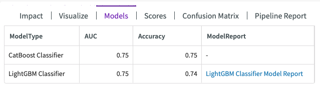
This shows us that two model types were used in training, a LightGBM Classifier with an accuracy score of 74%, and CatBoost Classifier with another accuracy score of 75%.
Let's also investigate the pipeline report provided for the model. Click Pipeline Report to view a table that breaks down the training stages with details on the parameters used to preprocess the data and train the model.
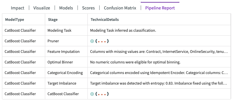
This report highlights several key details, including feature imputation for columns with missing values, the absence of eligible columns for optimal binning, and adjustments made to address target imbalances.
Predict on the Target Column
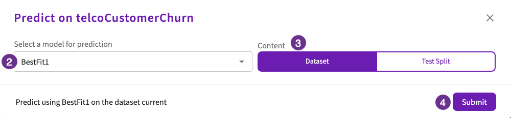
Now that we have a model built, we can predict with our BestFit1 model. Navigate back to the Data tab, then:
- Click Machine Learning > Predict in the skill menu.
- Select "BestFit1" for the model.
- Select "Dataset" for the content.
- Click Submit.
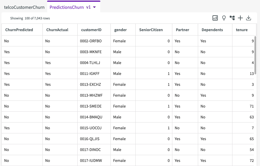
DataChat then generates a table called "PredictionsChurn", which includes two appended columns, "ChurnPredicted" and "ChurnActual", indicating whether a customer is predicated to churn, and whether or not they actually did.
DataChat also tests the model generated by Train Model above, "BestFit1", and displays testing scores in the conversation history.
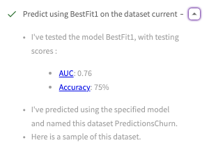
This displays the multi-classification AUC score as 76% and the accuracy score as 75%.