Guided Learning
This section guides you through how to create, edit, and modify charts in DataChat.
Load Data
To start, Load the "BikeShare.xlsx Dataset" into your session.
Ask the Data Assistant
With our data loaded, we can start by asking the Data Assistant to create some charts that visualize the relationship between riders and the weather. We can ask "Visualize allRiders by weatherSituation".
The Data Assistant generates a number of charts to visualize this relationship:
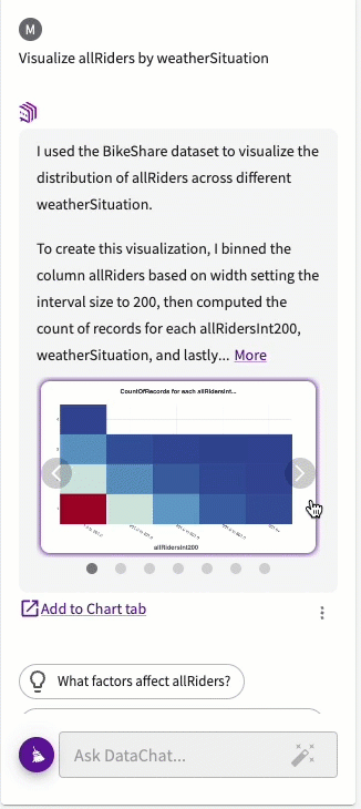
From these charts, we can see that weather situations 1 and 2 (clear and cloudy) account for about 95% of ridership, while weather situation 4 (heavy rain) comprises only 0.01% of total ridership.
To include these charts in the Chart tab, click Add to Chart tab.
Next, if we want to specifically plot a violin chart to visualize this relationship, we can ask "Plot a violin chart of allRiders by weatherSituation". The resulting chart looks something like this:
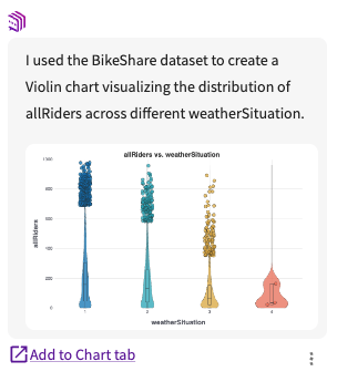
This chart helps us to better identify rideship distribution and outliers.
Add this chart to the Chart tab by clicking Add to Chart tab.
Open the Chart Builder
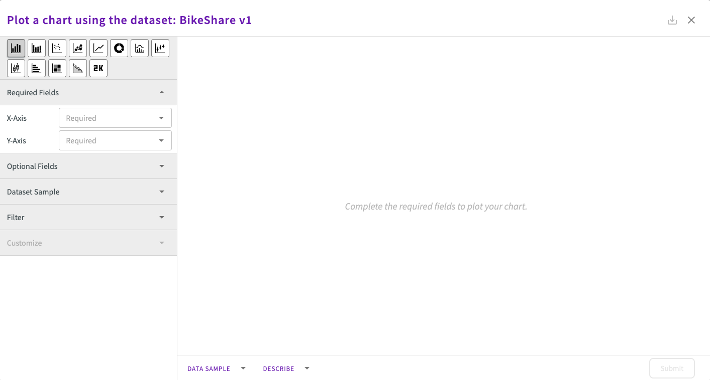
Let's also create some charts manually. To do this, open the chart builder by clicking Plot Chart in the skill menu.
The Chart Builder provides an interactive interface for refining our analysis through visualization.
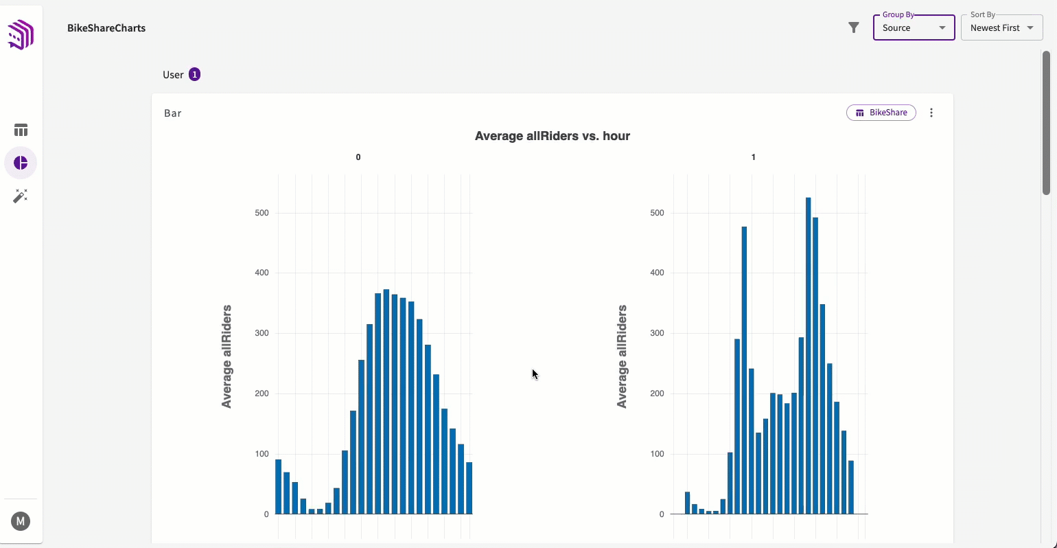
For example, if we want to better understand when people ride bikes, we can select "hour" for the X-Axis and "allRiders" for the Y-Axis in the Chart Builder.
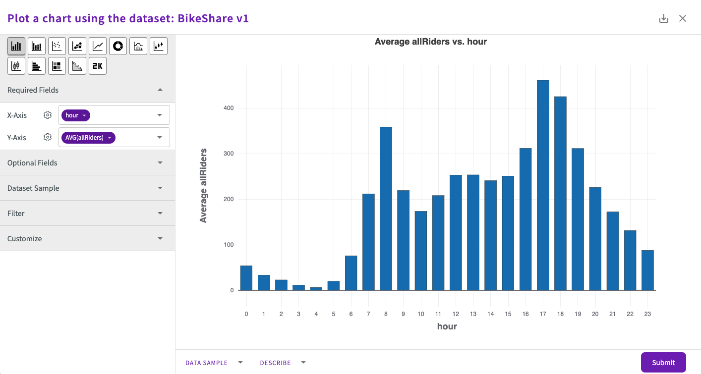
By default, the Chart Builder starts with the bar chart option. You can hover over the options to see what other chart types are available.
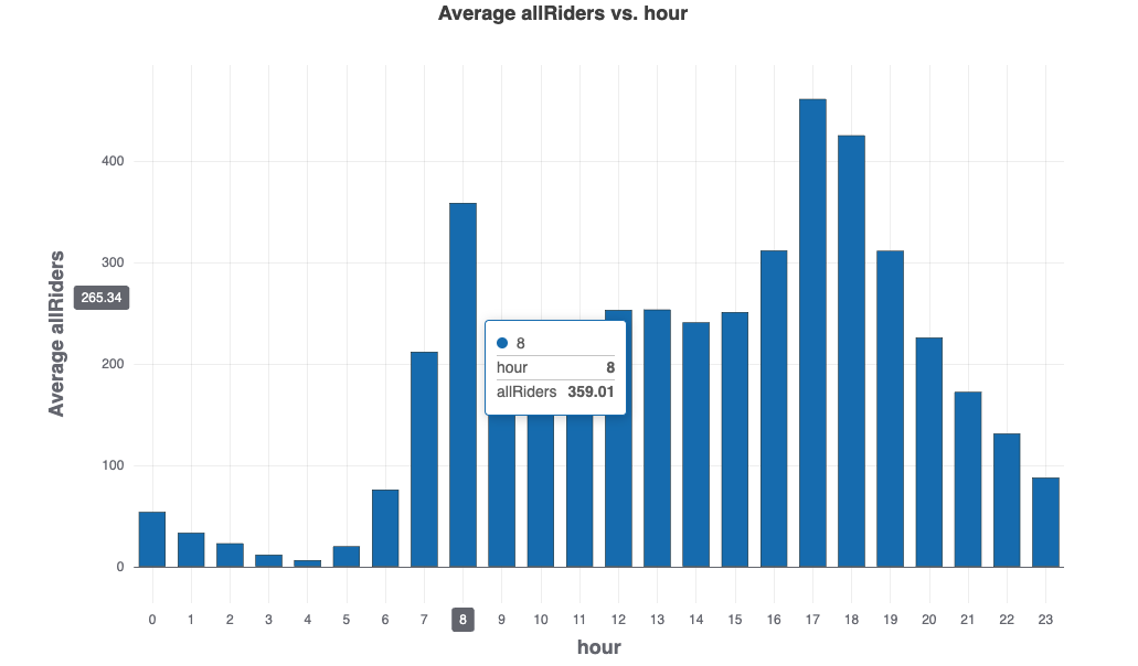
Hover over the lines for each hour to see the individual data points that make up each line.
From the chart, we can see the lowest number of riders at 4am, ramping up to a local maximum at 8am, and an overall peak at 5pm, indicating two rush-hour peaks per weekday. This pattern aligns with expected rush-hour travel times.
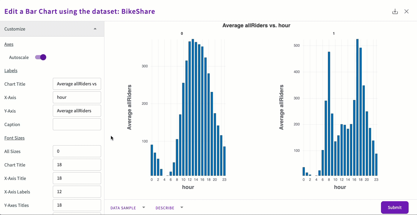
We can further analyze the data by examining workdays. Under Optional Fields, select "workingDay" from Subplot.
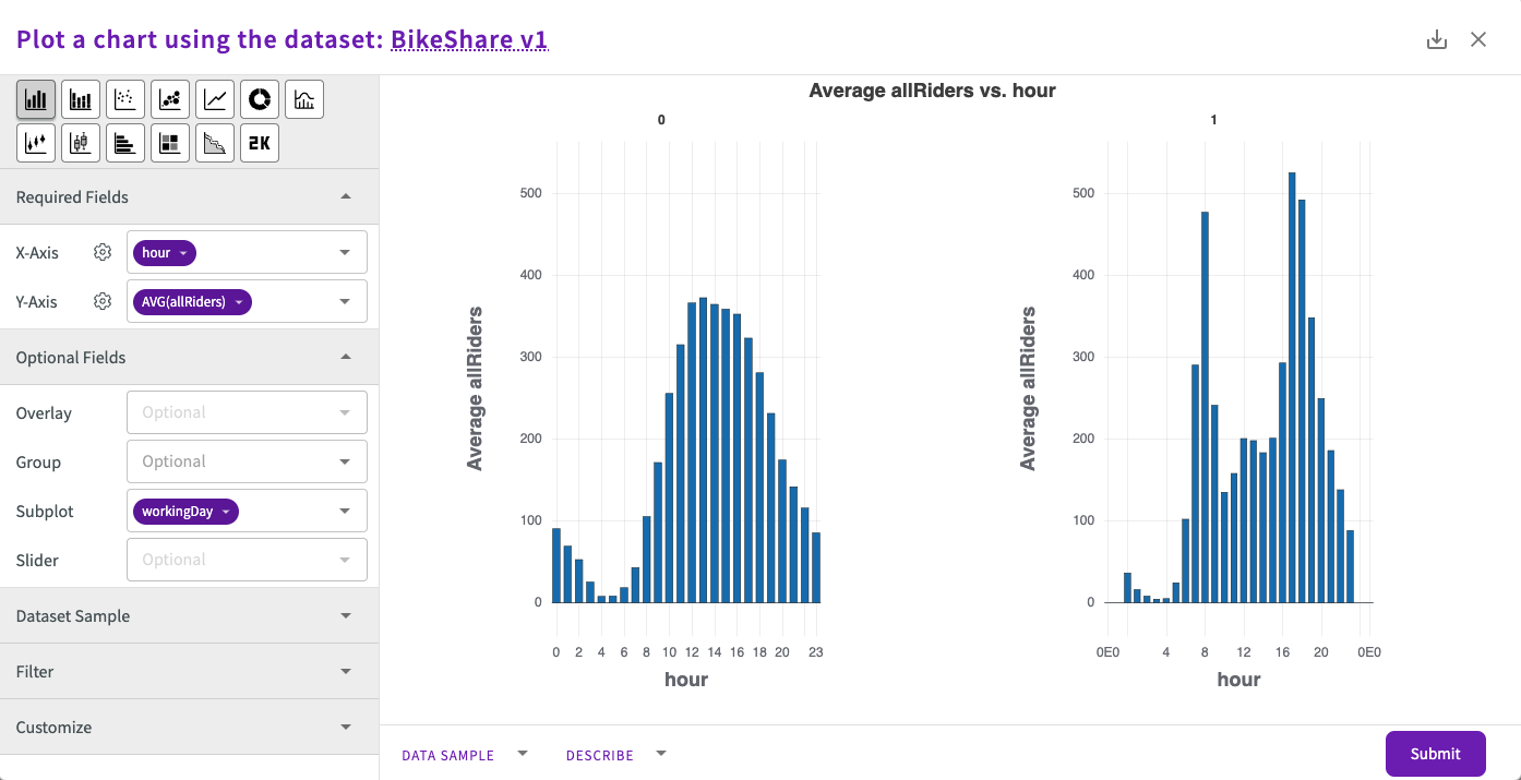
By observing the chart titles, we see that the leftmost chart represents data points where "workingDay" is 0, and the rightmost chart represents points where "workingDay" is 1. This visualization reveals that on workdays, ridership significantly decreases between the hours of 9am-5pm.
Using a subplot divides the main plot into subplots based on the values in the column selected in Subplot. In this case, the "workingDay" column is integer type. We can confirm this by clicking Describe at the bottom of the chart display.

Click Submit to add this chart to the Chart tab.
Use the Chart Tab
Let's organize our charts in the Chart tab by grouping them. First, click Group By > Source in the top right of the Chart tab.
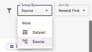
This groups our charts based on their creation source, either by the user or the Data Assistant. You can scroll up and down to view these grouped charts.
Next, lets apply a filter to focus only on charts created by the Data Assistant. Click Filter > User in the top right of the Chart tab.
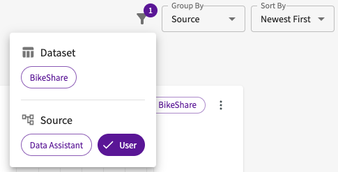
As a result, only the charts created by the Data Assistant are displayed, while the user-generated charts are hidden from view.
Edit Charts
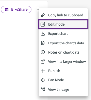
Let's add some customizations to our bar chart. Click More options > Edit Mode on the bar chart.
Customizations
This reopens the Chart Builder where we can apply some additional customizations. Click Customize and toggle autoscale to "On".
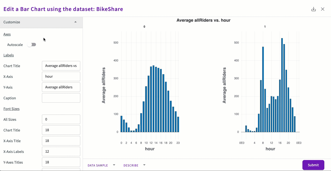
We can also change the chart's color by clicking the color icon and selecting a new color. Choose light green, then click Submit.
The changes are applied and the chart is saved.