Guided Learning
This chapter explores Insights Boards in DataChat using a Titanic dataset. For this example, we'll create tables and charts about ticket fares to add to an Insights Board.
Load Data
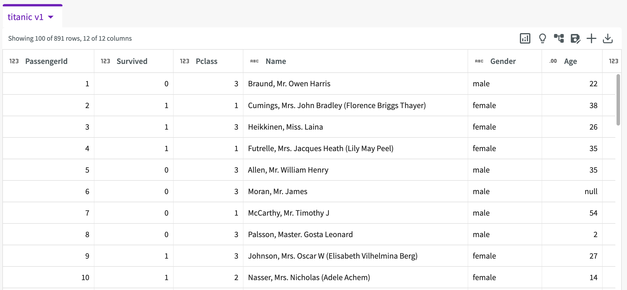
To start, Load the "Titanic Dataset" into your session. We're given a sample of our data that looks like this:
Create Objects
We need to create a couple of objects from this dataset that we can add to an Insights Board.
Pivot Tables
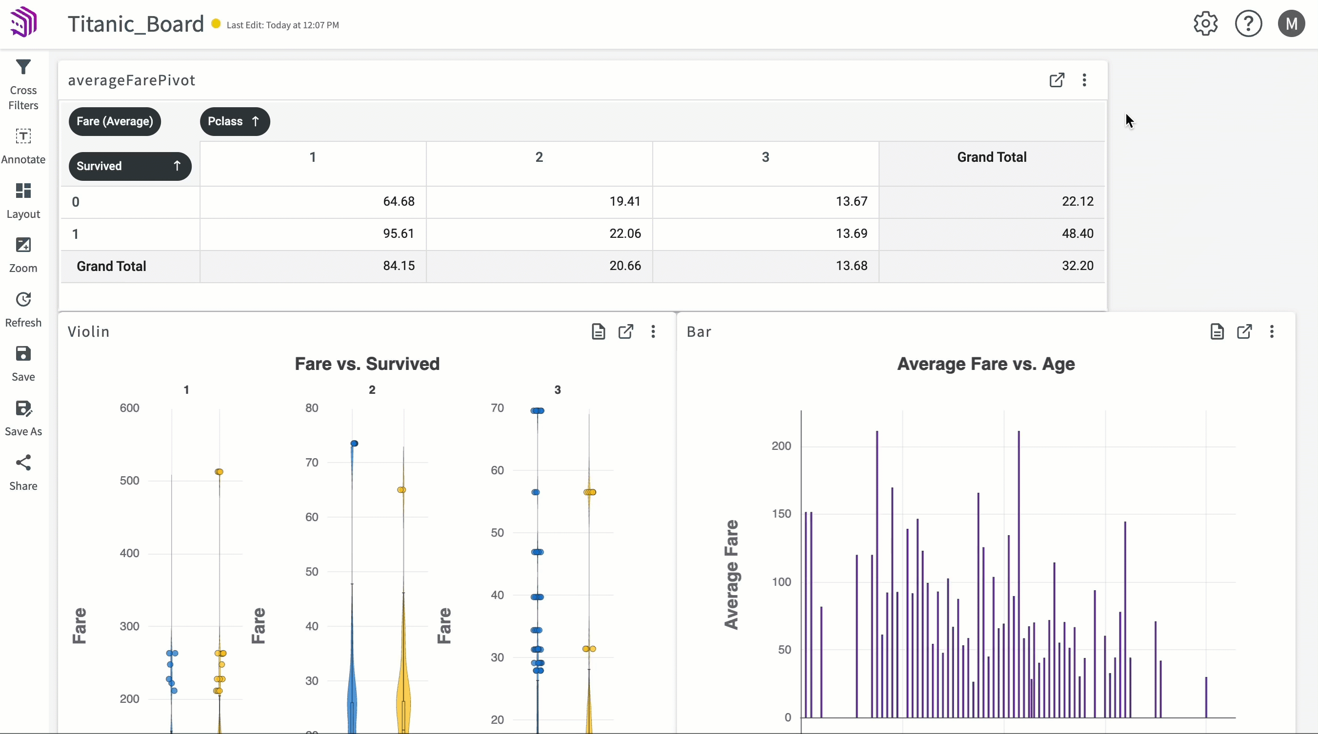
Let's create a pivot table using the Data Assistant to view the average fare costs for survivors and non-survivors across passenger classes. Enter "Pivot on average Fare creating rows from Survived and columns from Pclass". Optionally, you can also create this pivot table using the Show me something interesting feature. Note that this recommendation may not always be generated. To refresh the insight recommendations, click the Refresh button.
The chart appears in the Data Assistant output. Click Add to Chart tab.
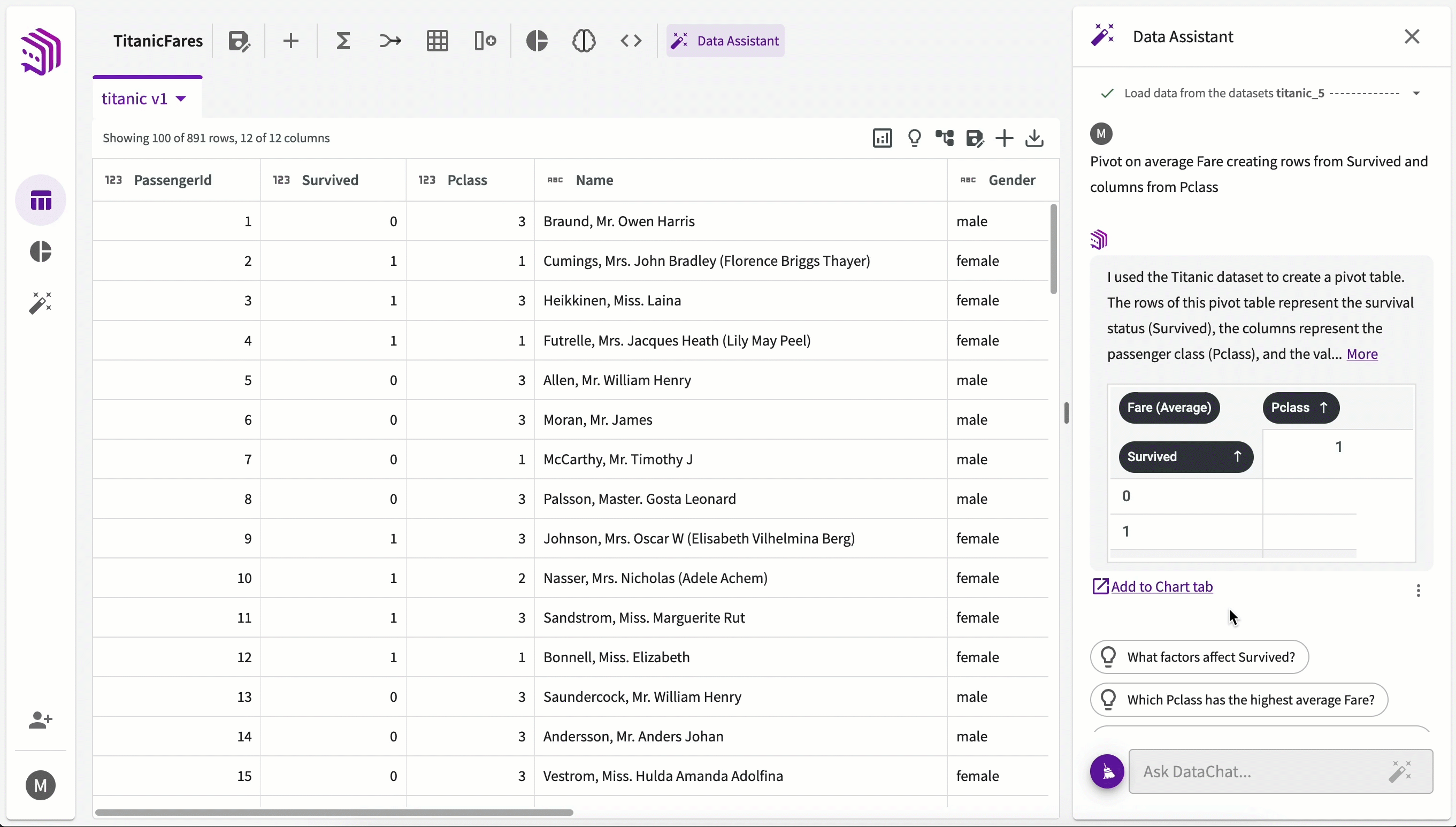
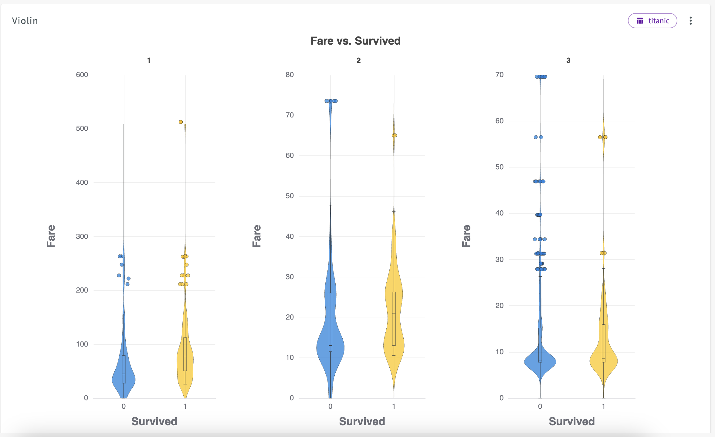
From here we can see that across all passenger classes, average Fare is higher for those who survived than those who didn't.
Charts
Let's create some visualizations to add as well. Let's say we'd like to visualize the relationship between fare and age for each passenger class. Navigate back to the Data tab, then:
- Click Plot Chart in the skill menu to open the Chart Builder.
- Select Bar Chart for type.
- Under Required Fields, select "Age" for the X-Axis and "Fare" for the Y-Axis.
- Under Optional Fields, select "Pclass" for Slider.
- Click Submit.
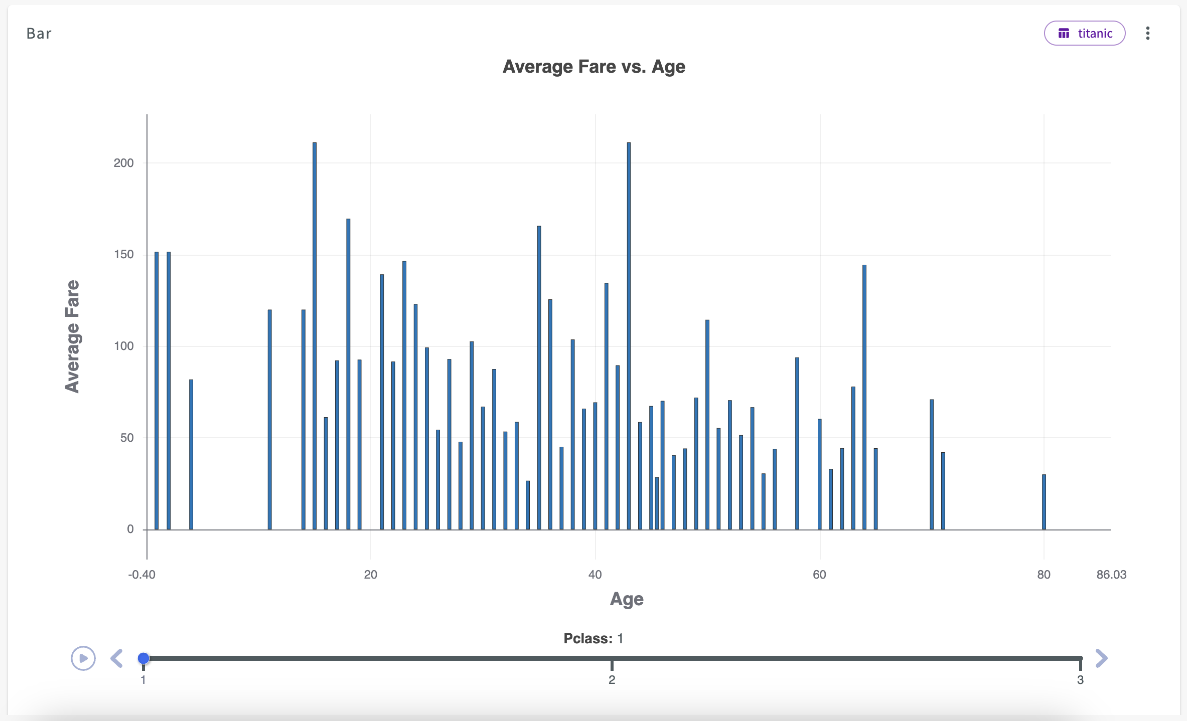
The chart appears in the Chart tab.
Let's now create a second chart to examine fare and survived. Hover over the Chart tab and click New Chart, then:
- Select Violin Chart for type.
- Under Required Fields, select "Survived" for the X-Axis and "Fare" for the Y-Axis.
- Under Optional Fields, select "Pclass" for Subplot.
- Click Submit.
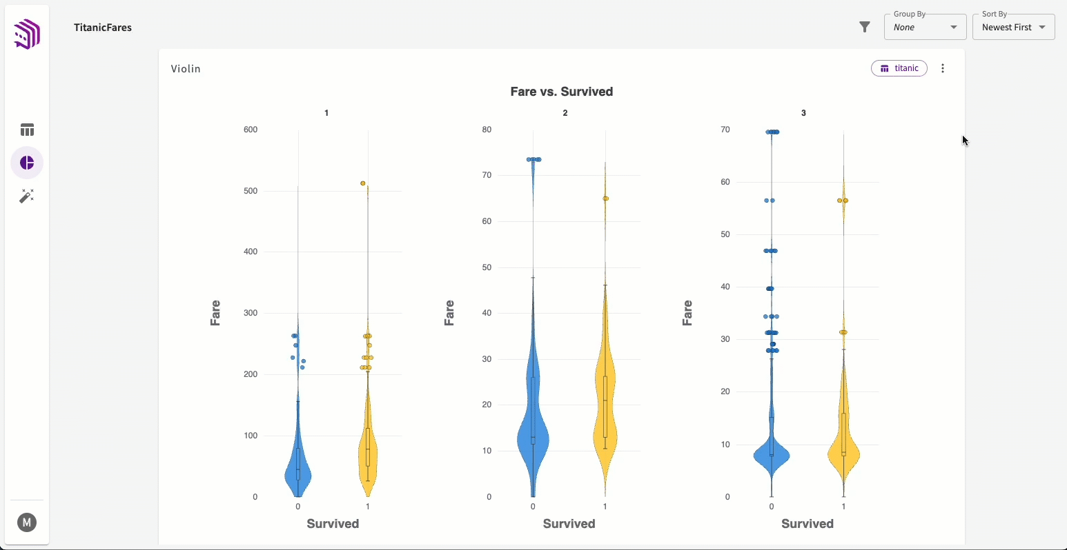
Add Objects to an Insights Board
Now that we have objects created, we can create an Insights Board to add them to.
Create an Insights Board
- Click more option from the violin chart's header.
- Click Publish.
- Click Create Insights Board and Publish.
- Enter "Titanic_Board" for the name, then click Submit.
Add Other Objects
- In the Chart tab, scroll to the bar chart.
- Click more options from the chart header.
- Click Publish
- Select "Titanic Board".
Repeat steps 2-4 for the "averageFarePivot" pivot table.
Edit and Use an Insights Board
Open an Insights Board
To view our Insights Board, "Titanic_Board":
- Return to the homepage.
- Double-click "Titanic_Board" from either the My Work or Insights Boards section.
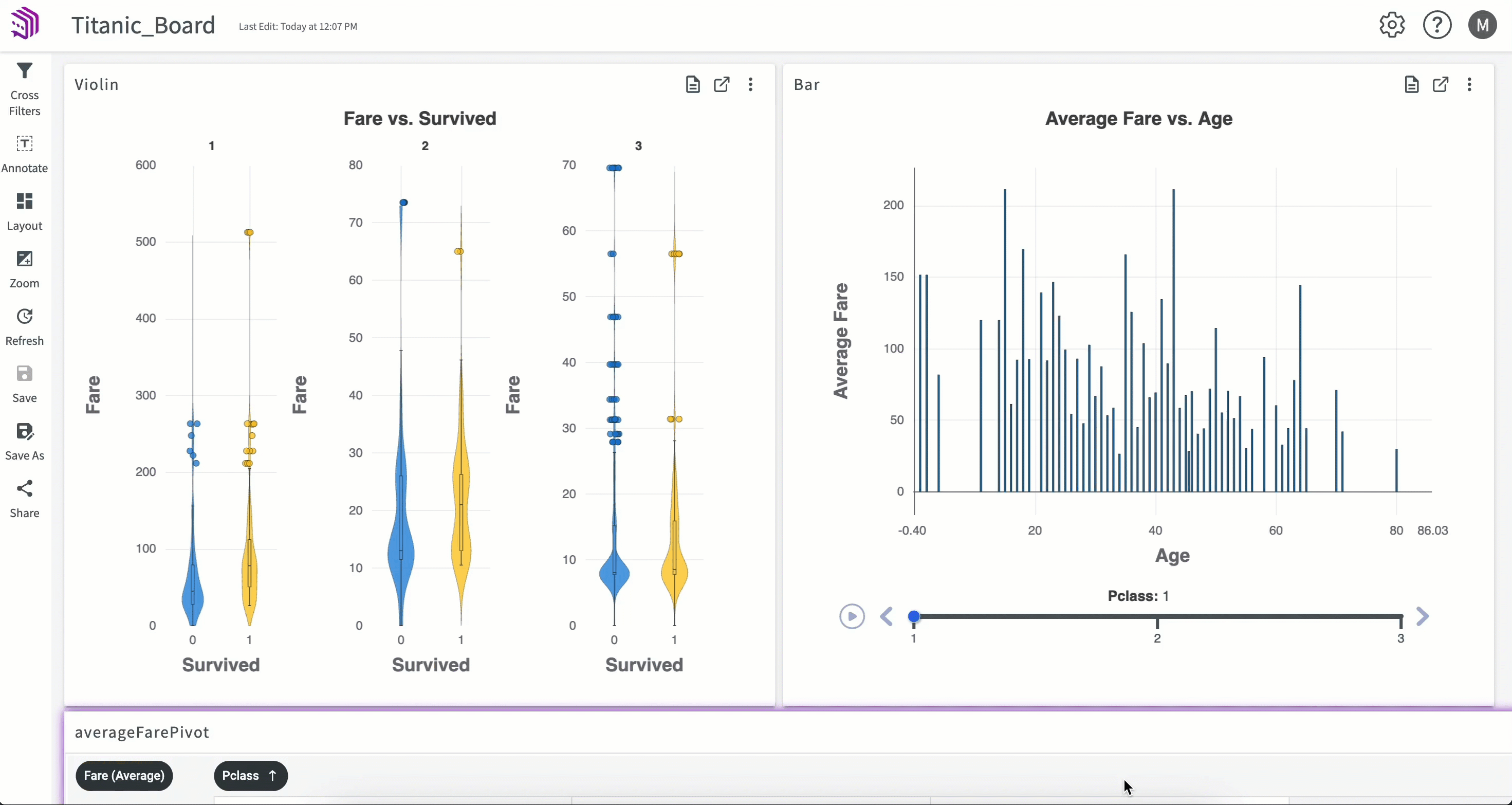
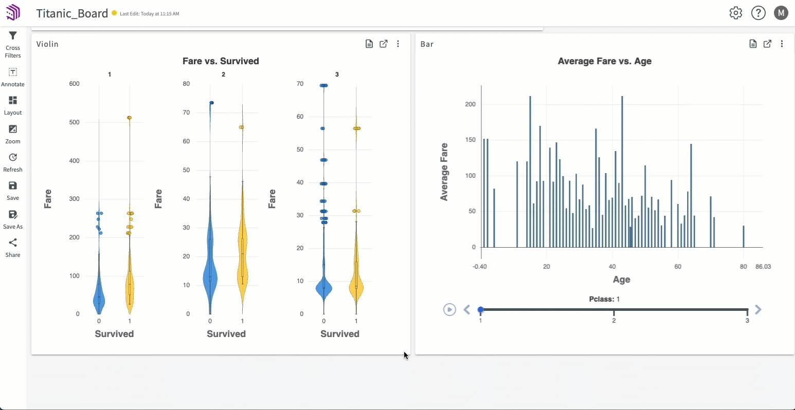
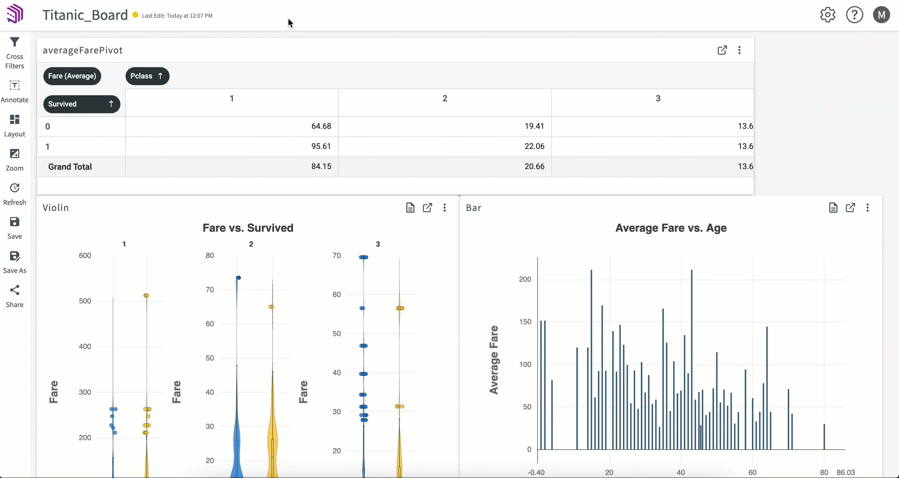
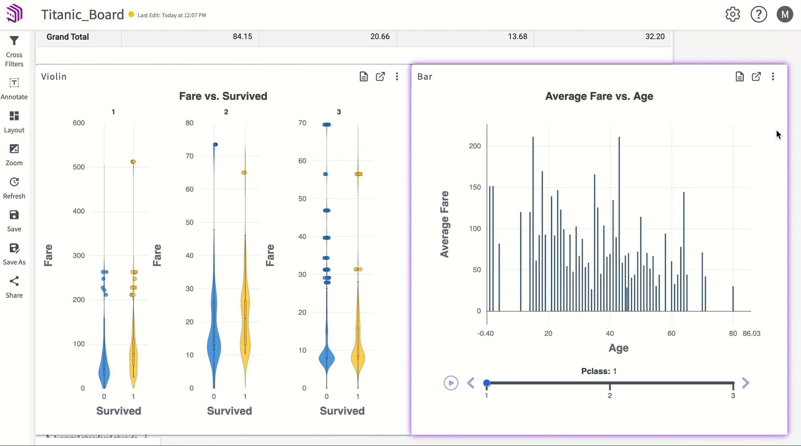
The Insights Board automatically opens with our published charts and pivot table:
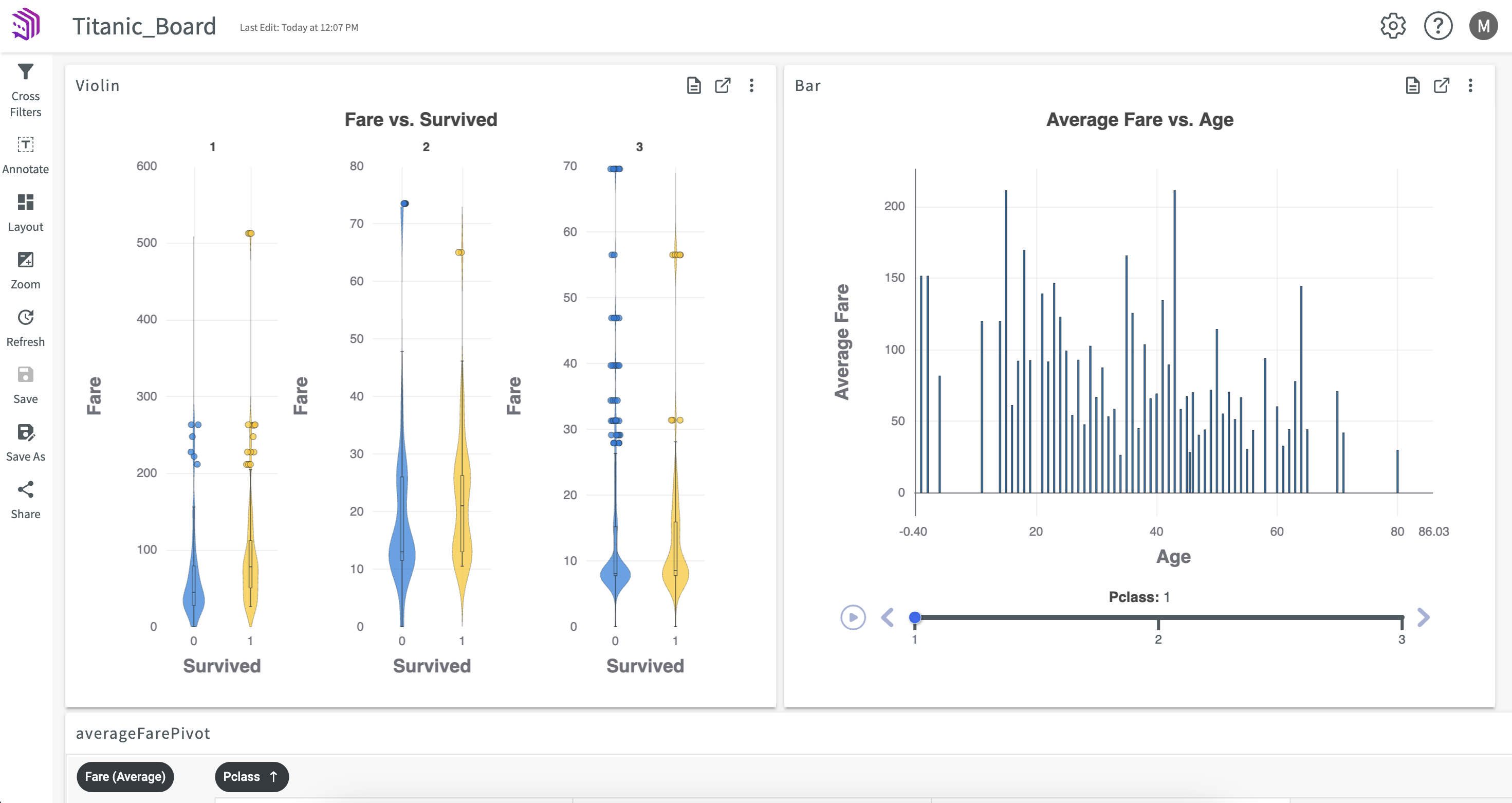
Move and Resize Object Panels
Let's say that we'd like to organize our Insights Board so that the charts are a bit larger and sit beneath the "averageFarePivot" pivot table.
-
Move the panels by clicking the top of the panel and dragging to the desired position.
-
Resize the panels by clicking and dragging the edge of the object panel.
Create an Annotation
Let's say we'd also like to make an annotation about the "Average Fare vs. Age" bar chart to call out that "Average Fare" decreases as "Pclass" increases.
- Click Annotate in the sidebar.
- Enter "Average Fare decreases as Pclass increases".
- Click Submit.
The annotation appears on the Insights Board. You can move and resize it, like other panels, to your desired position.
Edit Charts
From an Insights Board, we can also edit our charts. Let's say we'd like to change the "Average Fare vs. Age" chart to the color to purple:
- Click Edit mode.
- Click Customize to open the customizable option.
- Click the Color button, and select the purple option.
- Click Submit.
Remove Objects
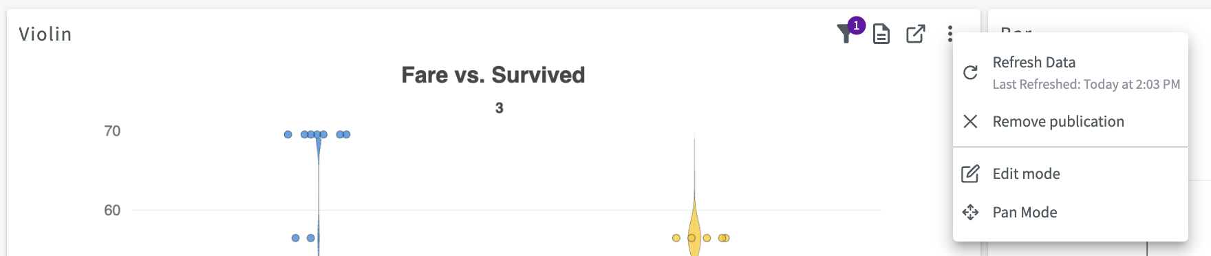
Let's say that we no longer need our "averageFarePivot" pivot table. We can remove the panel by clicking the Remove publication button.
Add Cross Filters
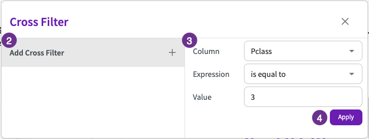
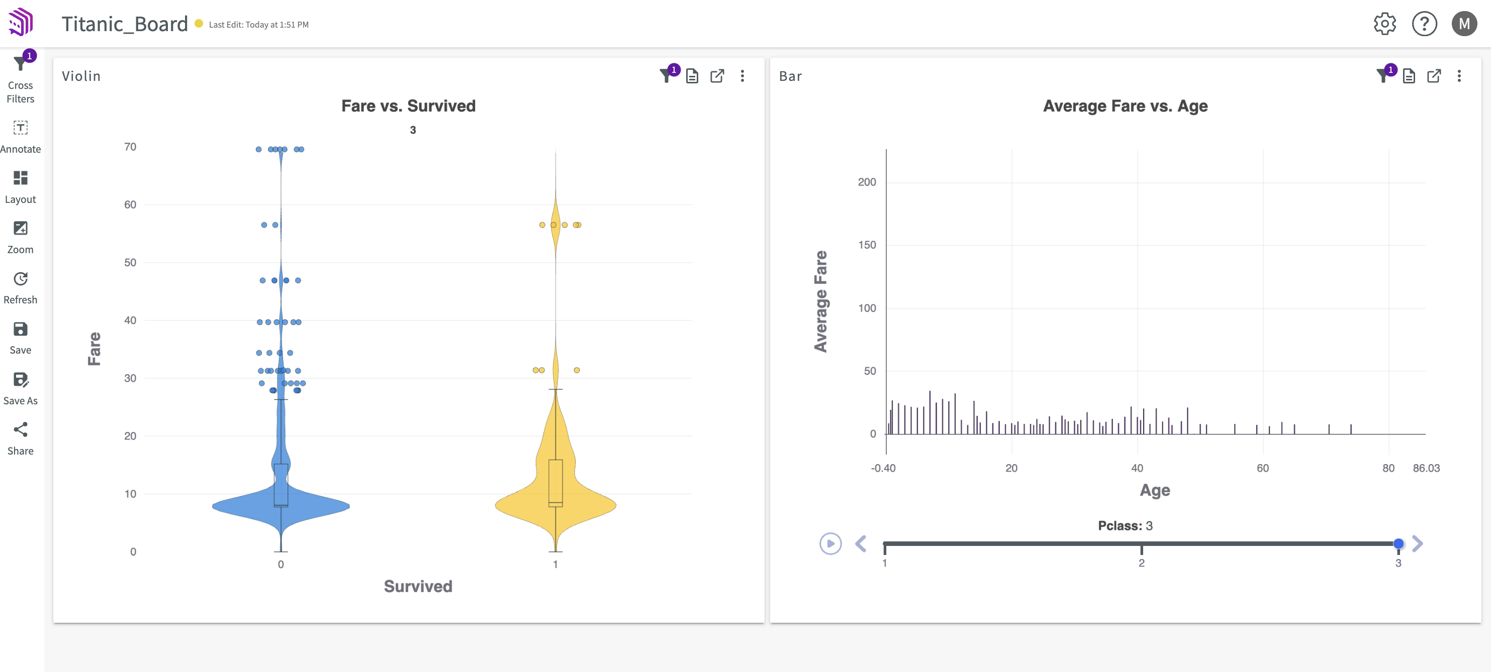
Let's say that we'd like to add a cross filter to our board so that we can easily look at only data on passengers in third class.
- Click Cross Filters in the sidebar.
- Click Add Cross Filter.
- Enter the "Pclass" for the column, "is equal to" for the expression, and "3" for the value.
- Click Apply.
The objects on our board now display only data on passengers in third class.
Refresh an Insights Board
Let's say we expect changes have been made to the underlying data associated with "Titanic_Board". We can refresh our Insights Board to rerun the underlying workflow and apply changes by clicking Refresh in the sidebar. You can also hover an object to display the most recent refresh.
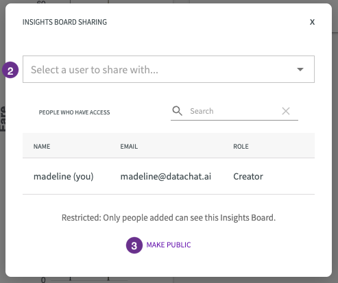
Share an Insights Board
Now that we have our Insights Board finalized with refreshed objects, we can share it with others using a link. To share "Titanic_Board":
- Click Share in the sidebar.
- Enter the name of a user to share with. You can remove users by clicking the X next to their role.
- Optionally, you can make the Insights Board public by clicking the Make Public button. This creates a link to "Titanic Board" that you can copy and share with anyone outside of your organization.