Add Weighting to Classification Models
Load Data
To begin, download the Students Adaptability Level in Online Education dataset to your machine. Note that this downloads as a .zip file. Open the .zip file and load the .csv file.
We're then given a dataset that looks something like this:
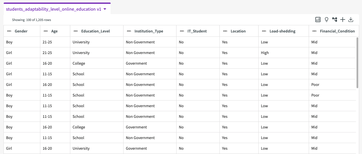
Our dataset contains the following columns:
- Gender. Gender of the student.
- Age. Age range of the student.
- Education_Level. Education institution level.
- Institution_Type. Type of educational institution.
- IT_Student. Whether the student is studying IT.
- Location. Whether or not the student is in-town.
- Load-shedding. Level of load shedding.
- Finacial_Condition. Financial condition of the student's family.
- Internet_Type. Internet type used on the student's device.
- Network_Type. Network connectivity type.
- Class_Duration. Daily class duration.
- Self_Lms. Whether or not the institution has their own learning management system.
- Device. Device mostly used in class.
- Adaptability_Level. Adaptability level of the student.
Rename Column
Before jumping into machine learning, let's first rename the "Load-shedding" column to instead use an underscore. Simply double-click the column name and enter "Load_shedding".

Train the Target Column
With our column cleaned, let's now use some machine learning techniques to reveal patterns. The Train Model skill trains a set of machine learning models and selects the model that best predicts how other columns in our dataset impact our target column:
-
Click Machine Learning > Train Model in the skill menu.
-
Select "Adaptivity_Level" for the target column.
-
Click Submit.
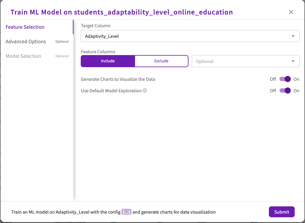
This uses default optimizations for our model.
Train Modelmight take some time to train various models on the data to select the best one.
Once Train Model is complete, an impact chart appears in the Chart tab, showing how each column in the dataset impacts the target column.
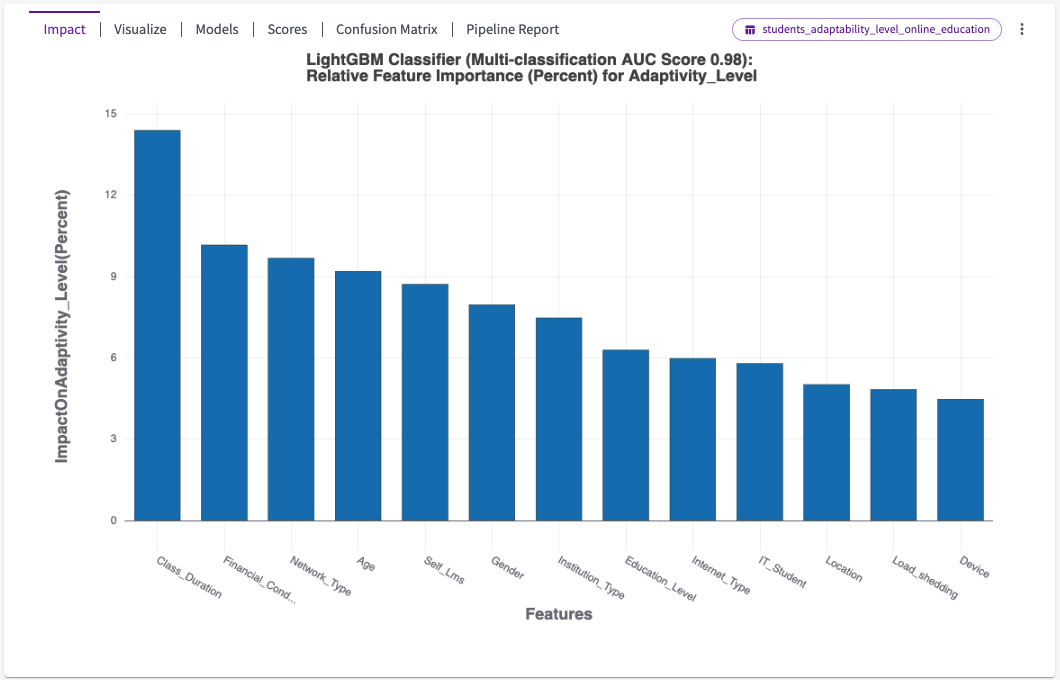
Hover over each bar in the chart to view more details. We can see that "Class_Duration" and "Financial_Condition" have the most impact on "Adaptivity_Level".
From here, we can click Visualize in the chart header. This provides a dropdown of different auto-generated charts that visualize the most impactful columns. By default, Visualize opens with Chart1A, in this case a stacked bar chart displaying the adaptability level for different class durations.
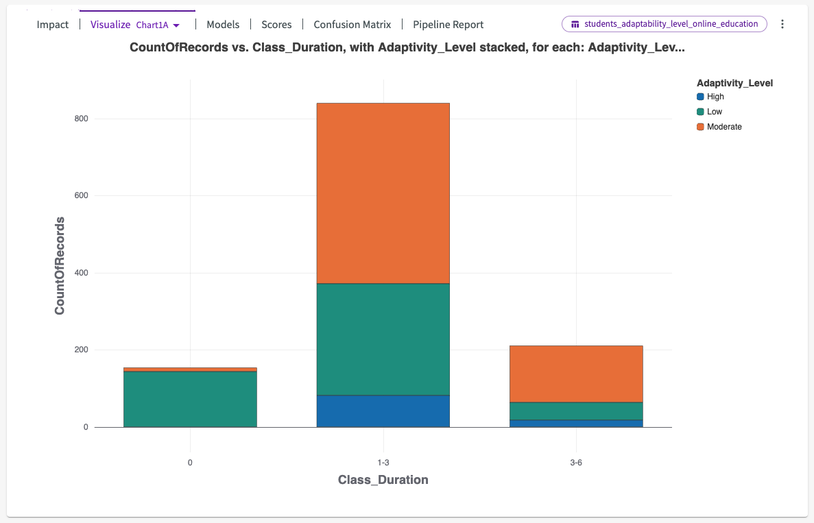
We can see that institutions with class durations less than an hour have significantly higher instances of low adaptability levels.
Let's investigate the models used in training. Click on Models to learn more about the model, which is called "BestFit1".

This shows us that two model types were used in training, a LightGBM Classifier with an accuracy score of 91%, and CatBoost Classifier with an accuracy score of 82%.
Tune the Model with Target Weighting
Earlier, we noted the inherent imbalance in the dataset from our initial Visualize chart. To compensate for the imbalance, Train ML Model automatically uses industry-standard imbalance handling mechanisms, such as oversampling and auto label-weighting, to focus on high adaptability levels.
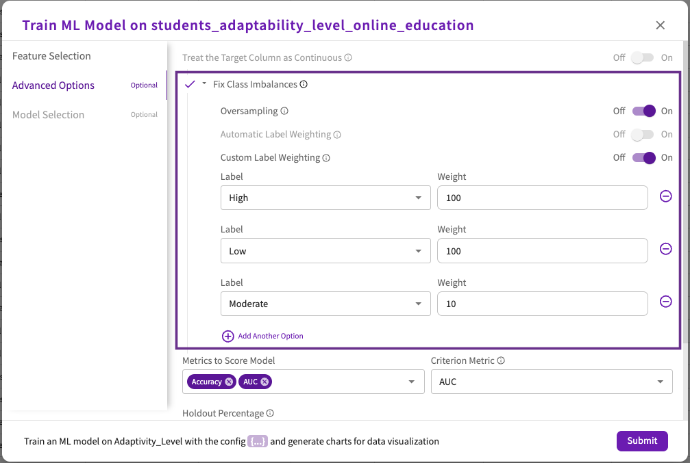
Let's tune our model to a specific set of adaptivity levels. This will give us a model that determines which factors are important only for "Low" and "High" adaptivity levels. We'll assign weights to these labels:
- In the Data tab, click Machine Learning > Train Model in the skill menu.
- Select "Adaptability_Level" for the target column.
- Click Advanced Options.
- Click Fix Class Imbalances to open a dropdown, then switch the Custom Label Weighting toggle "On".
- Enter "High" for the first label and "100" for its weight, "Low" for the second label and "100" for its weight, and "Moderate" for the third label and "10" for it's weight.
- Click Submit.
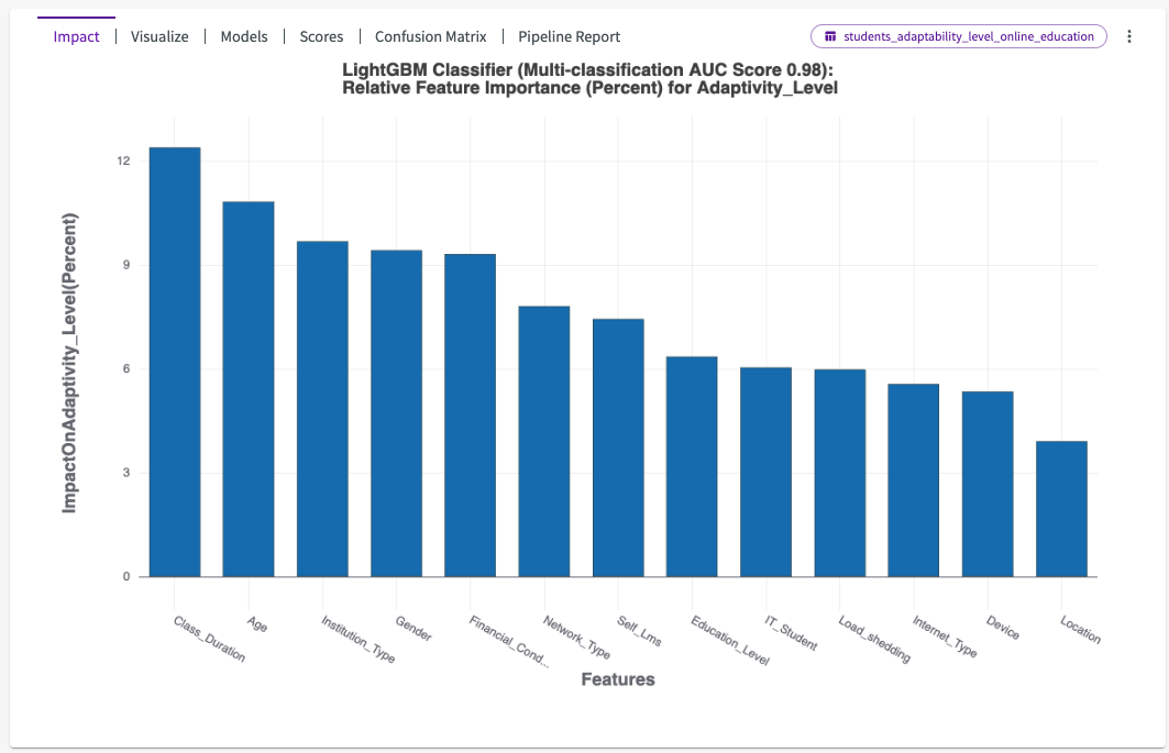
We can see that the impact has changed significantly. Although "Class_Duration" is still the most impactful, "Age" and "Institution_Type" have much more impact. We can also see that "Gender" has also increased in overall impact on "High" and "Low" instances of online adaptability.
Let's click Confusion Matrix from the chart header to visualize the model's AUC scores.
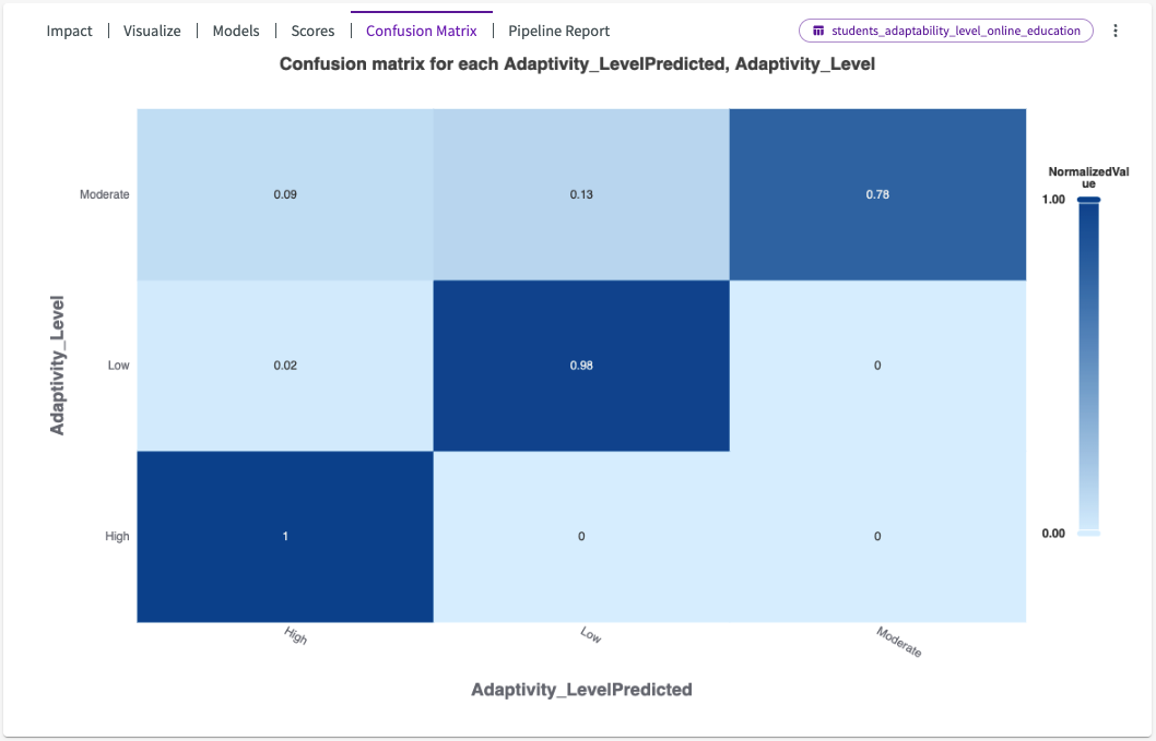
The confusion matrix reveals to us that the predicted values of "AdaptabilityLevel" are accurate in comparison to the actual values displayed in our data.
Let's use this model, BestFit2, to Predict on our dataset. From the Data tab:
-
Click Machine Learning > Predict.
-
Select "BestFit2" for the model.
-
Select "Dataset" for the content.
-
Click Submit.

We're then given a "PredictionsAdaptivity_Level" dataset that looks something like this:
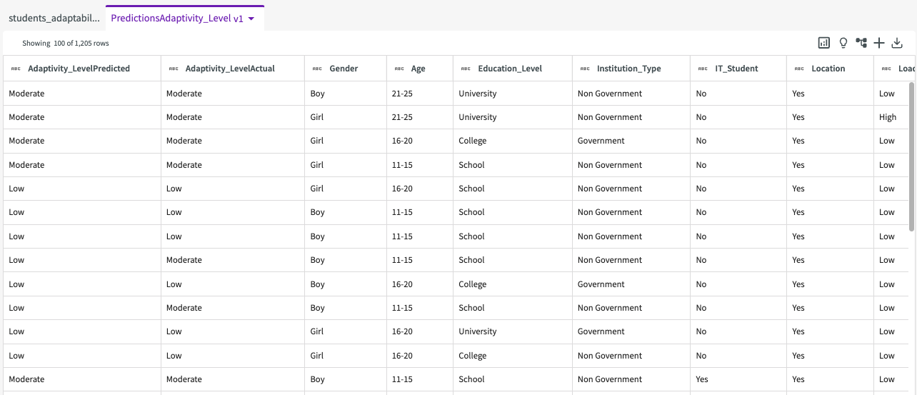
We can see that two columns have been added to the left side of the dataset, "Adaptivity_LevelPredited" and "Adaptivity_LevelActual", that show the predicted values and actual values.
Plot Prediction Accuracy
Let's visualize the accuracy of our predictions. First, let's create a new column that compares "Adaptivity_LevelPredited" and "Adaptivity_LevelActual", setting the value to "true" if they match and "false" if they don't:
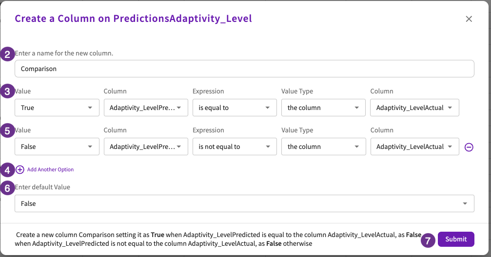
- Click Add Column > Using Conditional Values in the skill menu.
- Enter "Comparison" for the column name.
- Enter "True" for the value, "Adaptivity_LevelPredited" for the column, "is equal to" for the expression, "the column" for the value type, and "Adaptivity_LevelActual" for the column.
- Click Add Another Option.
- Enter "False" for the value, "Adaptivity_LevelPredited" for the column, "is not equal to" for the expression, "the column" for the value type, and "Adaptivity_LevelActual" for the column.
- Enter "False" for the default value.
- Click Submit.
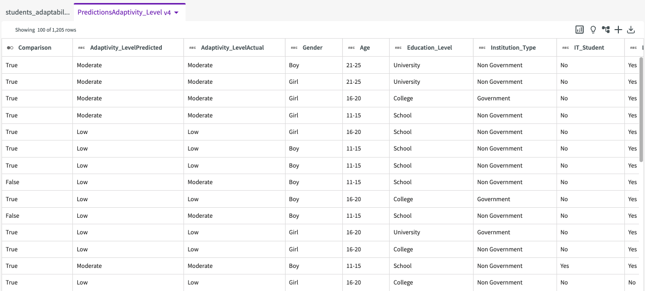
We're then given a dataset with an added "Comparison" column:
From here, let's plot a donut chart to visualize this comparison:
- Click Plot Chart in the skill menu.
- Select "Donut Chart" for the type, and "Comparison" for the split.
- Click Submit.
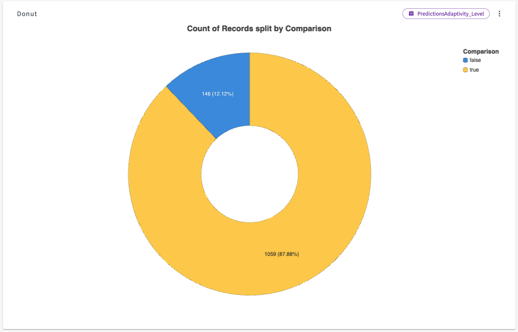
The resulting donut chart shows us that our predictions were 87.88% accurate.