Clean and Illustrate Time Data
You often need to manipulate your data a bit before you can create meaningful charts or models. In this example, we'll use some data from a bike sharing company to illustrate a bit of data wrangling goes a long way toward discovering deeper insights from your data.
Load Our Data
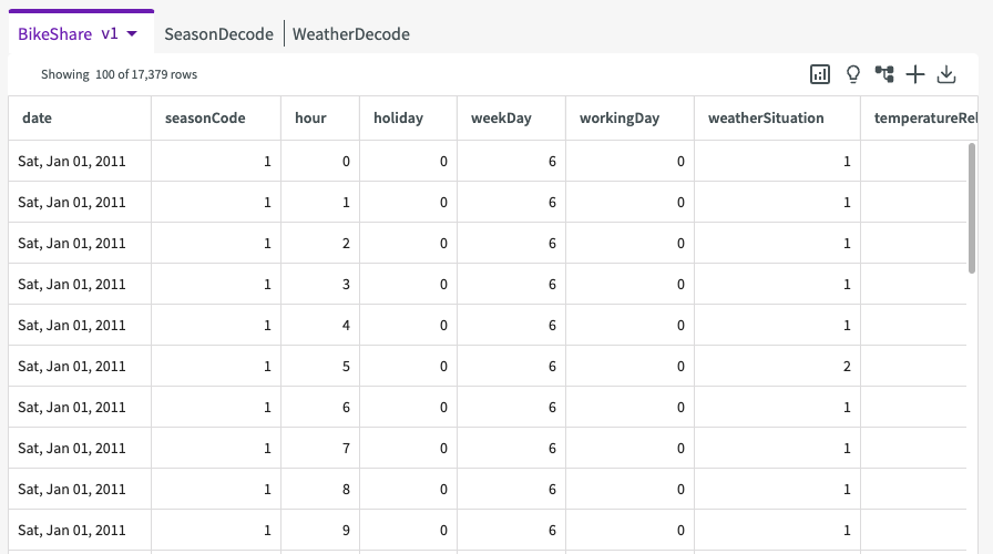
To start, Load the Bikeshare dataset into the session. We're then given a sample of our dataset that looks something like this:
Create a Simple Chart
Let's start with a simple violin chart that shows us the distribution of all riders, regardless of whether they're casual or registered riders, for each hour of the day. To do that, we can use the Chart Builder:
- Click Plot Chart in the skill menu to open the Chart Builder.
- Select "Violin Chart" for type.
- Under Required Fields, enter "hour" for the X-Axis and "allRiders" for the Y-axis.
- Click Submit.
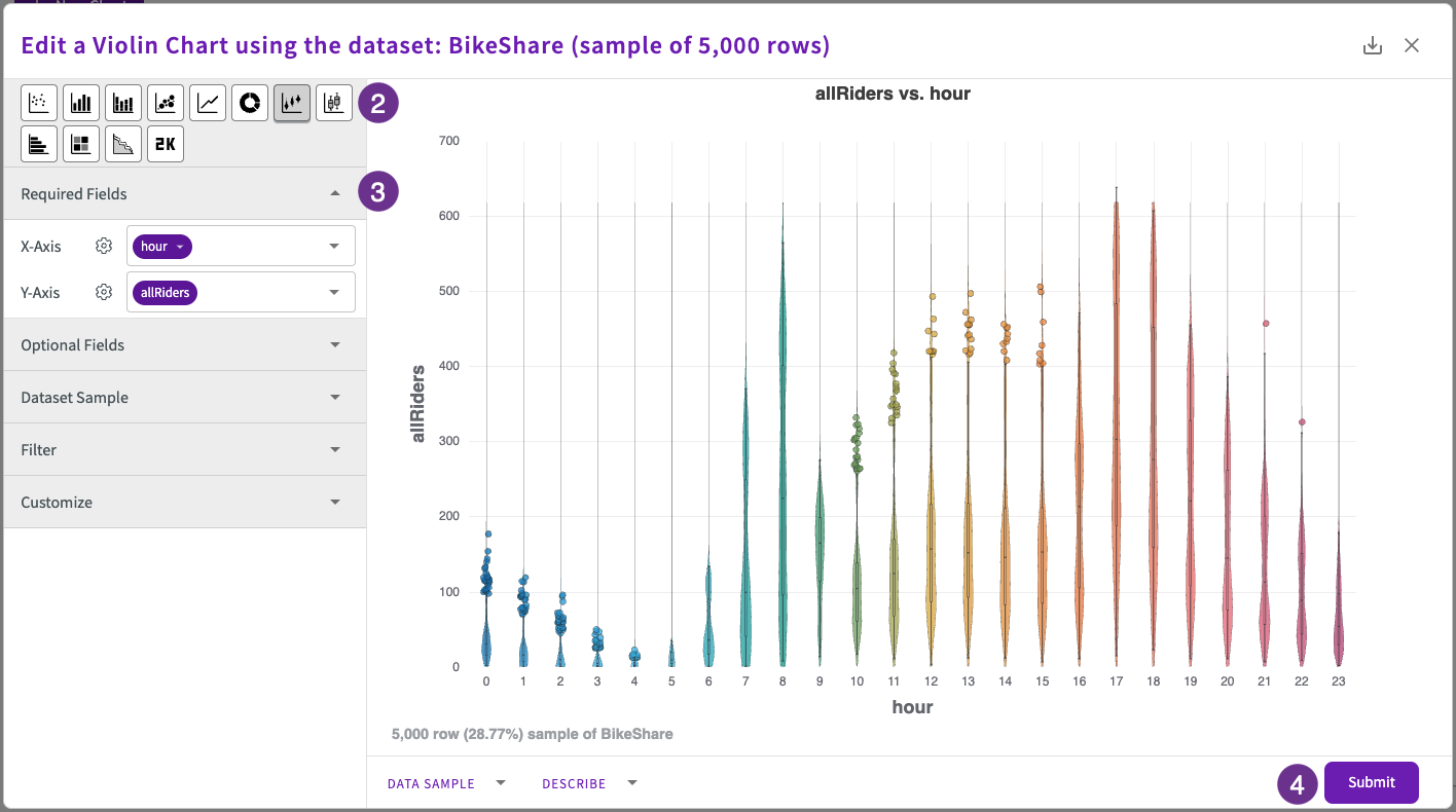
Violin charts are great for exploring value distributions in your data and finding outliers.
Here, we can see interesting trends, such as most of our ridership comes from the 7AM to 9AM and 5PM to 6PM commutes, but what else can we uncover with just a bit more wrangling?
Wrangle Our Data
Let's investigate how the weather impacts ridership. To do that, we'll want to look at the year as a whole, not just the hours of the day. We can create a new columns with Extract and use Compute to wrangle our data into more manageable pieces before creating another chart.
Extract
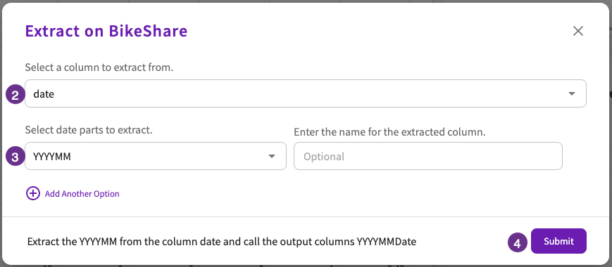
Let's Extract the month and year from the Date column. Navigate to the Data tab, then:
- Click Add Column > Extract.
- Enter "date" for the column.
- Enter "YYYYMM" for the date parts to extract.
- Click Submit.
Compute
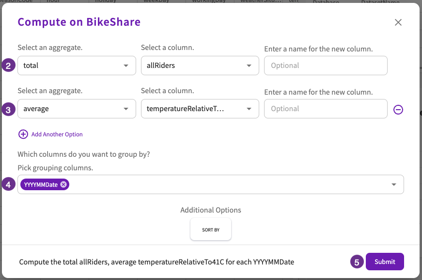
Now, we can Compute the number of riders and the average temperature (relative to 41 degrees Celsius) for each month of the year:
- Click Aggregate > Compute.
- Enter "total" for the aggregate and "allRiders" for the column, then click Add Another Option.
- Enter "average" for the aggregate and "TemperatureRelativeTo41C" for the column.
- Enter "YYYYMMDate" for the grouping columns.
- Click Submit.
Create a Chart
Using our computation from the previous step, let's visualize the data with a scatter chart:
- Click Plot in the sidebar to open the Chart Builder.
- Select "Scatter Chart" for type.
- Under Required Fields, enter "YYYYMMDate" for the X-Axis and "TotalAllRiders" for the Y-Axis.
- Under Optional Fields, enter "AverageTemperatureRelativeTo41C" for Group.
- Click Submit.
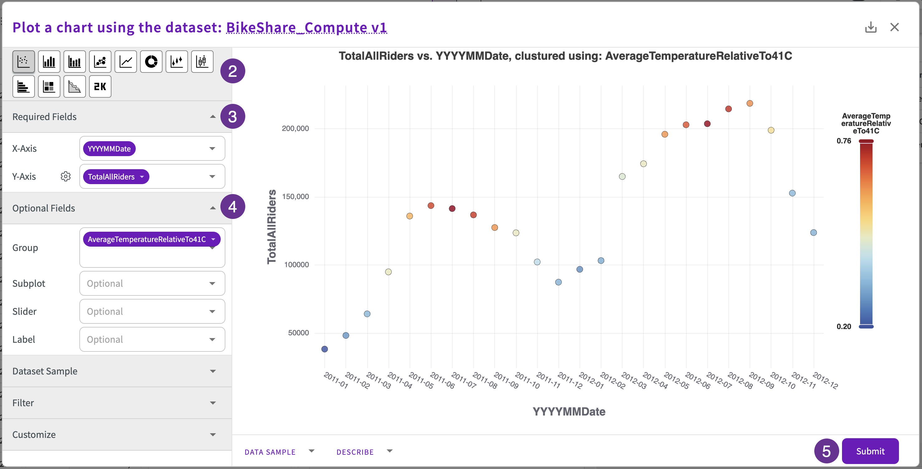
The resulting scatter chart clearly shows how ridership increases and decreases with regards to the average temperature:
We can then use these insights to inform our decisions around staffing, marketing, inventory, and more.