Explore Data with the Chart Builder
The Chart Builder is a great way to start exploring your data and identifying trends. In this example, we'll explore the data about the passengers aboard the Titanic.
Load Our Data
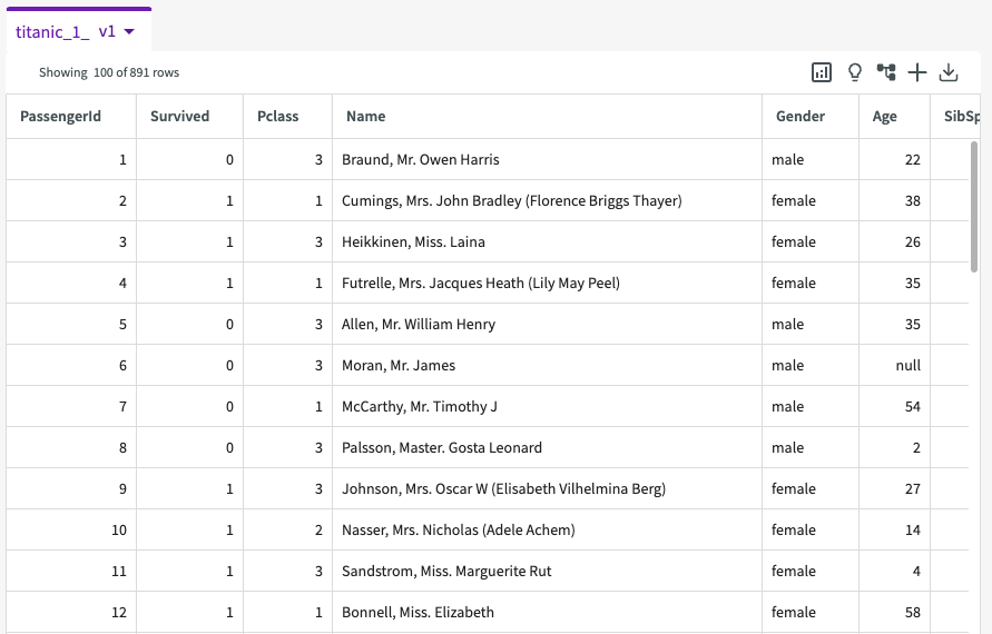
First, let's Load the "Titanic Dataset" into our session.
Create a Simple Scatter Chart
First, let's explore the relationship between a passenger's age and the fare they paid to board the Titanic. We can use the steps below to create a scatter plot showing each passenger's age and the fare they paid. We'll also split the passengers by gender and add a slider (which lets us manipulate the value of a specific variable) so we can see how each of the passenger classes compare:
- Click Plot Chart in the skill menu to open the Chart Builder.
- Select "Scatter Chart" for the type.
- Under Required Fields, enter "Age" for the X-Axis and "Fare" for the Y-Axis.
- Under Optional Fields, enter "Gender" for the Group and "Pclass" for the Slider.
- Click Submit.
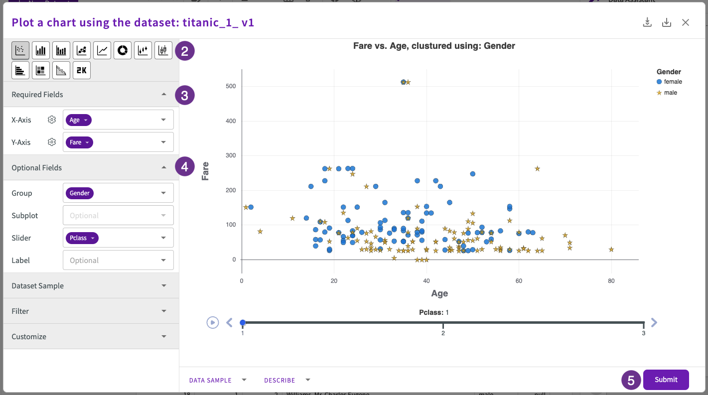
We can see that, predictably, the fares are lower as you move from first class to second class to third class. What's interesting here is that the fares for women (the blue dots) seem to be generally be higher for men (the gold stars) across the classes. Let's explore that trend with some light computations and a new chart.
Compute and Then Plot
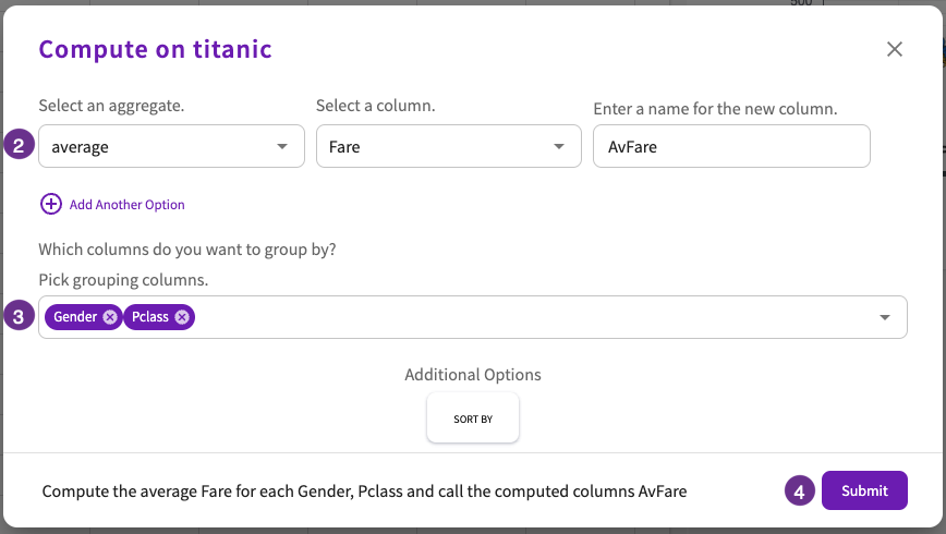
Let's Compute the average fare paid by each gender for each passenger class. Navigate back to the Data tab, then:
- Click Aggregate > Compute in the skill menu.
- Enter "average" for the aggregate, "Fare" for the column, and "AvFare" for the new column name.
- Select "Gender" and "Pclass" for the grouping columns.
- Click Submit.
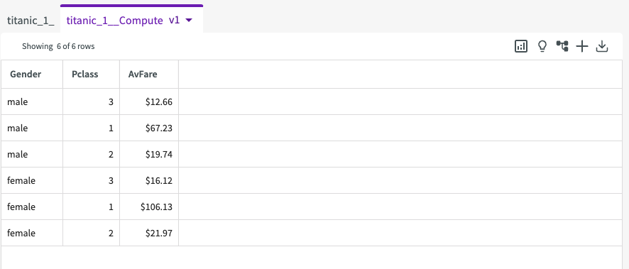
The resulting "titanic_Compute" dataset looks like this:
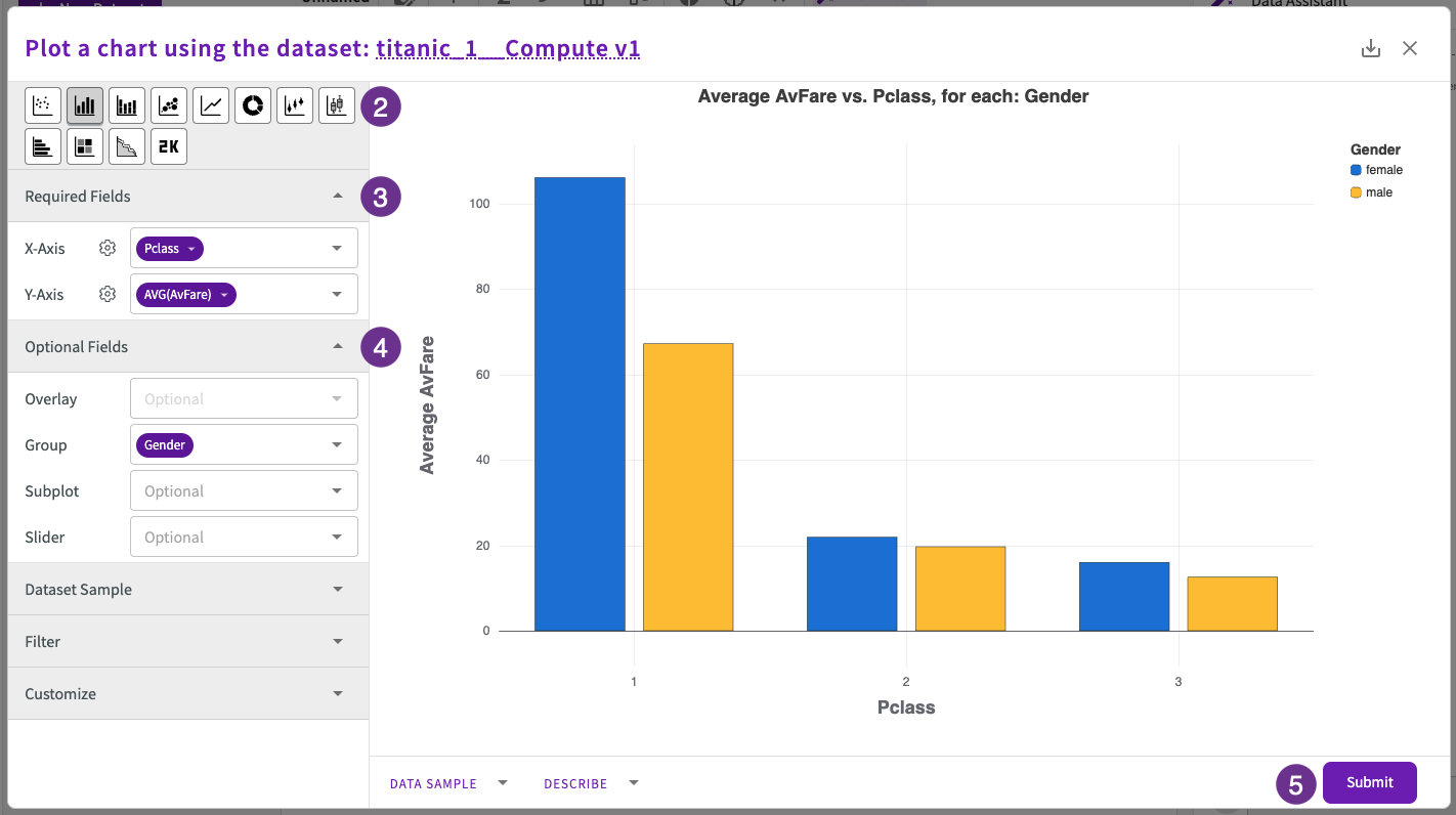
Now, let's use a bar chart to compare the average fare paid by men and by women in each passenger class:
- Click Plot Chart in the skill menu to open the Chart Builder.
- Select "Bar Chart" for the type.
- Under Required Fields, enter "Pclass" for the X-Axis and "AvFare" for the Y-Axis.
- Under Optional Fields, enter "Gender" for Group.
- Click Submit.
Edit a Chart
We make our chart more clear by changing the title name, axis names, and adding a note of our findings:
-
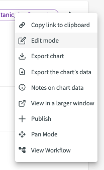
Click the Edit mode button in the bar chart's More menu.
-
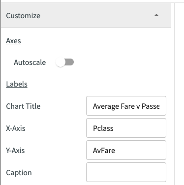
Under Customize, rename the Chart Title to "Average Fare v Passenger Class for each Gender" and rename the Y-Axis to "AvFare".
-
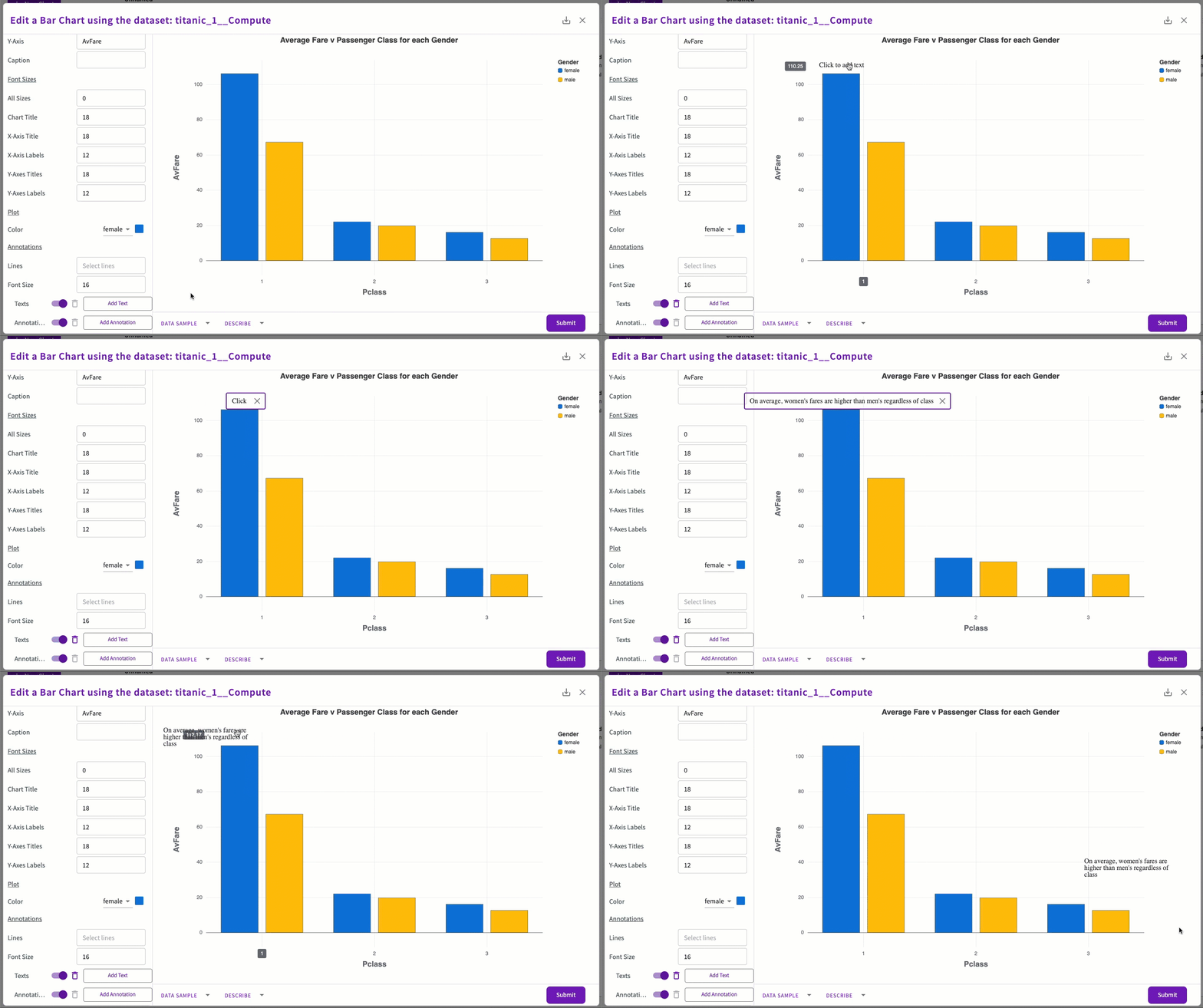
Double-click Add Text and enter "On average, women's fares are higher than men's regardless of class".
-
Click Submit.
We can see that the trend we noticed earlier holds true. This chart clearly illustrates that, on average, women paid more than men regardless of their class.