Create, Explore, and Predict Moving Averages with Time Data
In this example, we'll explore trends in bike share data to learn how to create moving averages and predict how the average might change in the future.
Load Our Data
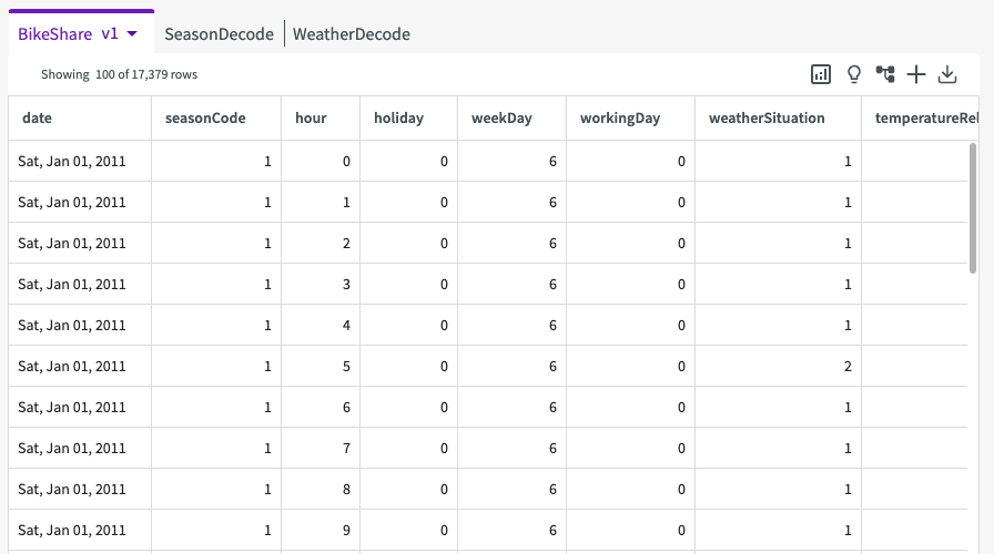
To start, Load the "BikeShare.xlsx Dataset" into your session. We're given a sample of our data that looks something like this:
Create Exploratory Plots
Let's try to plot some of this data and see if we can see any trends:
-
Click Plot Chart in the skill menu to open the Chart Builder.
-
Select "Bar" for the chart type.
-
Under Required Fields, enter "date" for the X-Axis and "allRiders" for the Y-Axis.
-
Under Optional Fields, enter "weatherSituation" for the slider.
-
Click Submit.
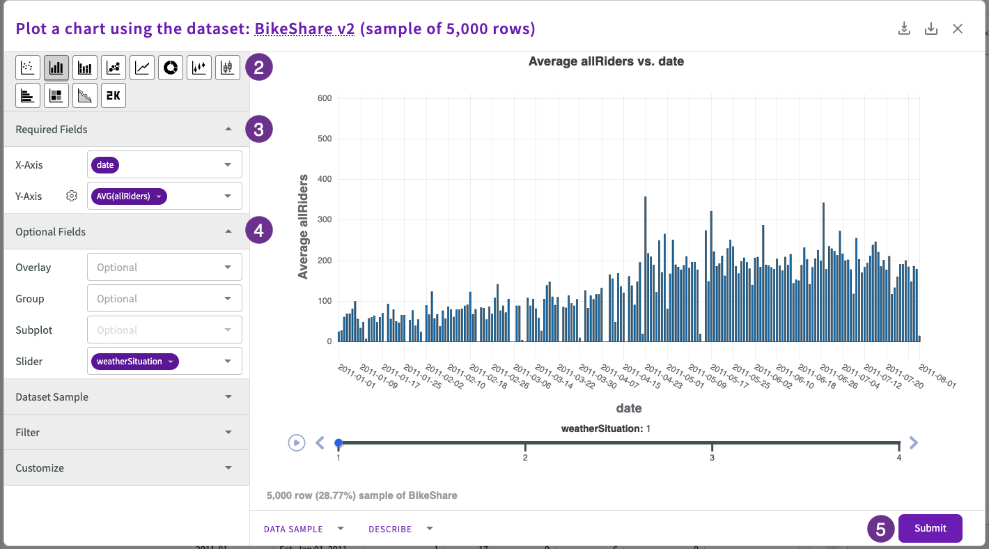
We can see some broad trends over time, but the data is noisy and we can see that there are some outliers that can skew our trend lines.
Create a Moving Average
With data like this, a moving average helps smooth out our data so it's not so affected by outliers and errors. Let's now calculate a seven day moving average of daily ridership (indicated by the value of the allRiders column). We can do by using the Create Column form to create a new window column that takes a specified range of rows (which represent a date in our case) and computes the average number of new riders over that time frame:
-
Click Add Column > Using a Window Query in the skill menu.
-
Enter "7dayMovingAverage" for the name.
-
Enter
as average allRiders for each weatherSituation sorted by the columns date computed over the row range that looks back from the current position by 7 and looks forward by 0.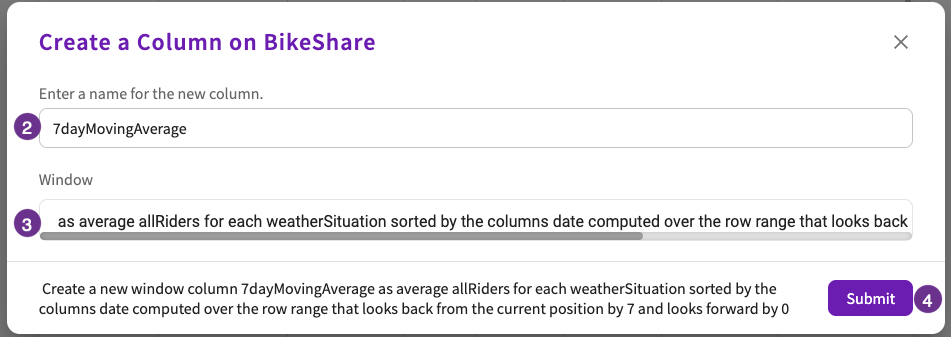
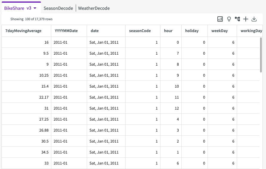
It's best practice to keep your time variable (such as dates) on the x-axis when you're exploring trends over time.
Before we continue, let's break down this step a little bit:
-
Create a new window column 7DayMovingAveragetells DataChat what type of column it should be creating and what it should be called. -
as average allRiderstells DataChat what the primary calculation should be. In this case, we want to compute the average number of riders. -
for each weatherSituationtells DataChat to compute the average number of "allRiders" for each value of the "weatherSituation" column. -
sorted by the columns called datetells DataChat how to sort the final results. In our case, we want to sort the resulting dataset by the date column. -
computed over the row range that looks back from the current position by 7 and looks forward by 0is the other key piece of this step. This section defines the time frame, or window, DataChat should use when it calculates the average number of "allRiders" for each "weatherSituation". In this case, we want to use the number of "allRiders" from the last seven days (each of which is a row) and include the current day in the calculation.
Now that we understand how we created our moving average, let's see how it helps our plots. Use the step below to create another bar chart. This time, we'll use our moving average instead of the raw "allRiders" count:
-
Click Plot Chart in the skill menu.
-
Select "Bar" for Type
-
Under Required Fields, enter "date" for the X-Axis and "7DayMovingAverage" for the Y-Axis.
-
Under Optional Fields, enter "weatherSituation" for the slider.
-
Under Dataset Sample, select "All Rows" and click Apply.
-
Click Submit.
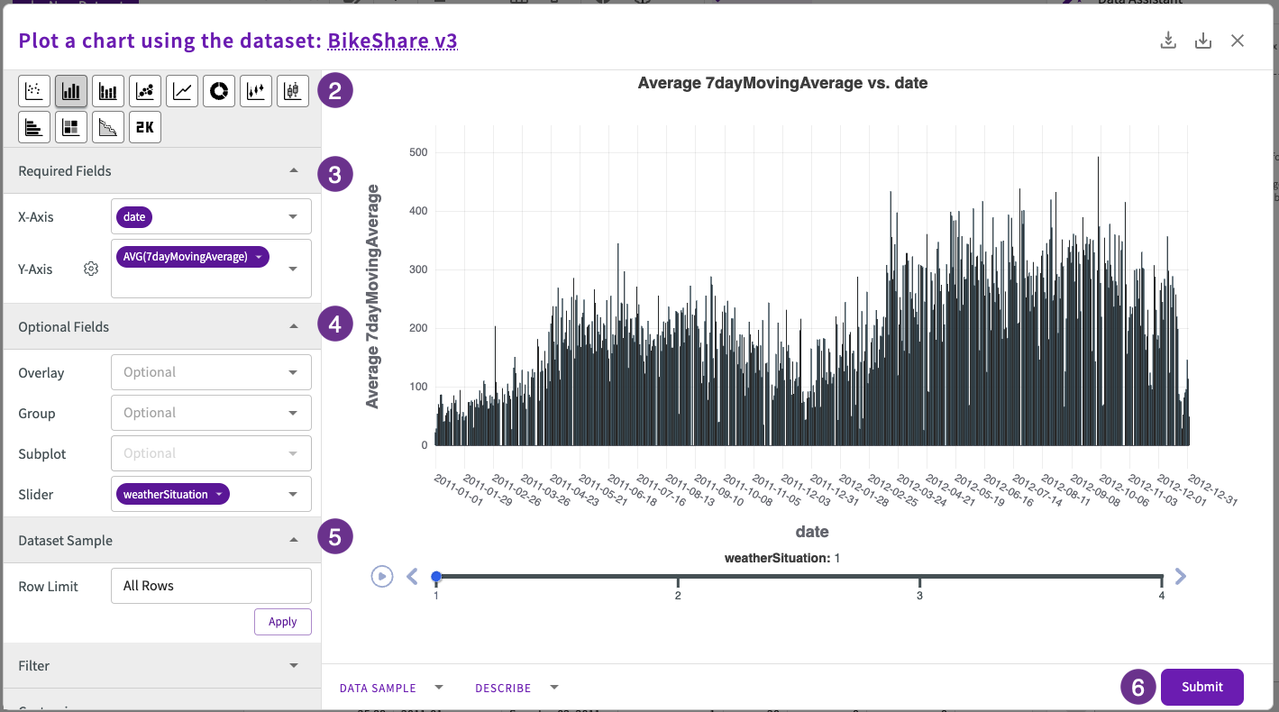
Notice how much more smooth and pronounced the trend is with the moving average. Also, notice that while we still have some outliers, they aren't nearly as drastic. With the moving average, we can clearly see "allRiders" dropping quickly and staying low over as weatherSituation values increase.
Train Time Series Data
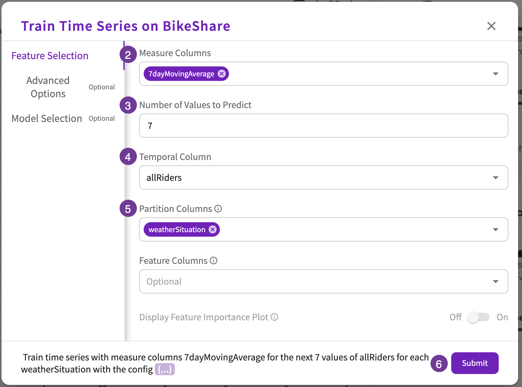
Looking at this dataset, we might ask, "What does the future look like?" In DataChat, we can quickly answer that question with the Train Time Series form. In this case, let's focus on how the moving average will change over the next seven days:
-
Click Machine Learning > Train Time Series in the skill menu.
-
Enter "7DayMovingAverage" for the Measure Column.
-
Enter "7" for the Number of Values to Predict.
-
Enter "allRiders" for the Temporal Column.
-
Enter "weatherSituation" for the Partition Column.
-
Click Submit.
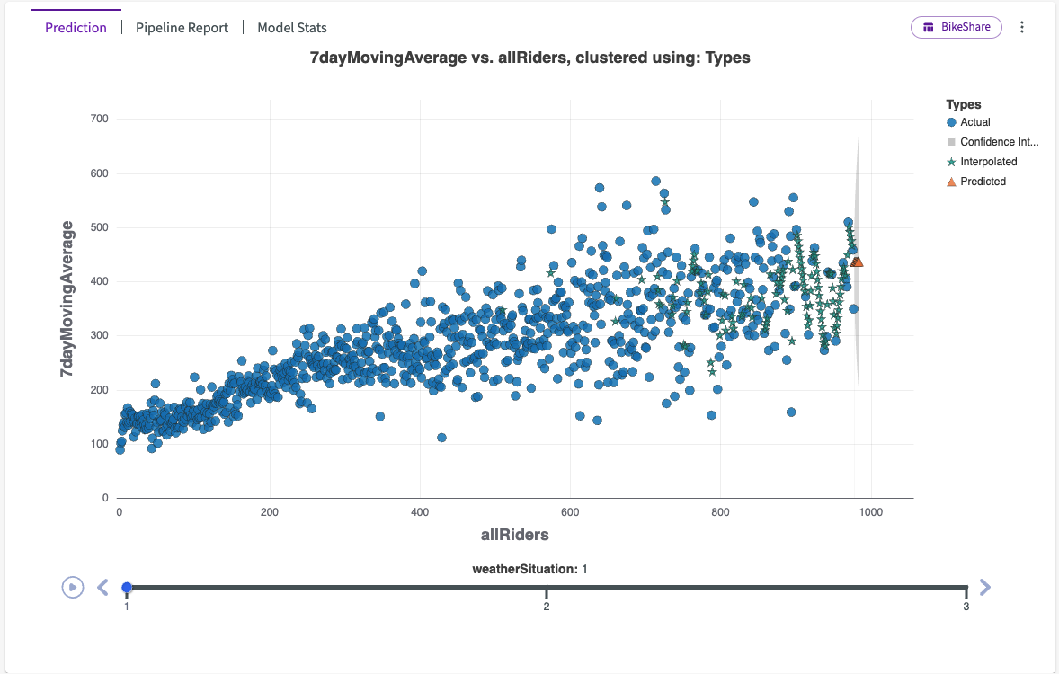
The orange triangles represent the predicted value for each day of the next week. The gray area represents the confidence interval, which means that DataChat is 80% confident that the real value on that day will fall within that shaded area.