Guided Learning
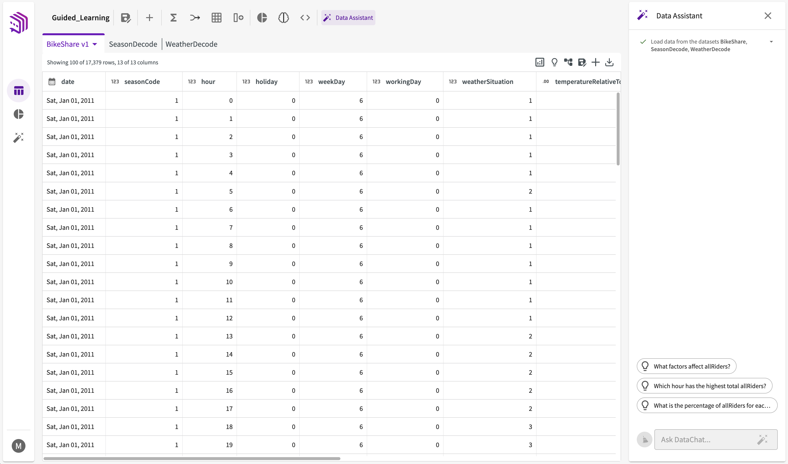
In this section, we'll walk through asking questions with the Data Assistant using a dataset from a bikeshare company. Note that this guided learning is using the Data Assistant feature within the Data tab, however, the same steps can also be executed within the Data Assistant tab.
Load Data
To start, Load the "BikeShare.xlsx Dataset" into your session and open the Data Assistant within the Data tab.
Show Me Something Interesting
Let's start by exploring our data. Click Show Me Something Interesting in the table header to display a list of recommended insights based on the data.
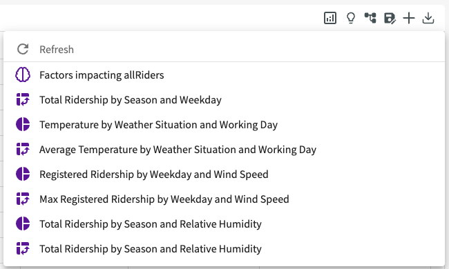
Click Total Ridership by Season and Weekday. Note that you may need to refresh the recommendations to generate this suggestion. The Data Assistant then automatically runs the steps needed to create this pivot table. Once complete, it's displayed in the Chart tab:

From the pivot table, we can see the total counts of ridership across each season and weekday, with fall consistently having the highest ridership on average across all days of the week.
Ask Questions
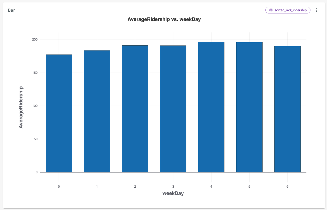
Let's investigate the weekdays impact on ridership a bit further. Navigate back to the Data tab, then ask "Which weekday has the highest average ridership across all seasons?"
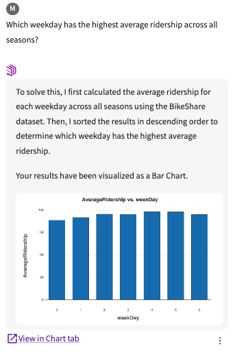
The Data Assistant then generates a solution, showing weekday 4 has the highest average ridership across all seasons at 196.44 riders.
Click View in Chart tab to see the entire chart:
View the Workflow
Let's verify the Data Assistant work. Click the More menu > Workflow beneath the response to view the steps taken:
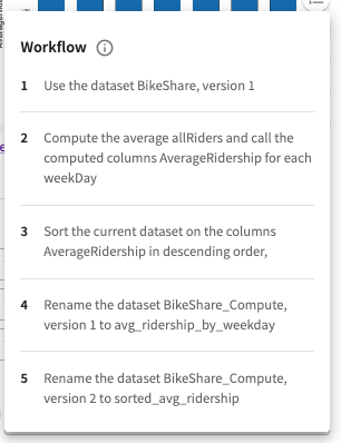
Here, we can confirm that the values were correctly computed for each weekday.
Provide Feedback
Since we're happy with the results that the Data Assistant provided, let's give the response positive feedback. Click the More menu > Thumbs-Up. This helps the Data Assistant to learn and provide better results with each question.

Ask More Questions
Visualizations
Let's ask a couple more questions, starting with "Visualize average allRiders by temperature." The Data Assistant generates a solution, showing that ridership generally increases as the temperature rises, but starts to decline rapidly when the temperature exceeds 41°C (or a relative value of 0.98).
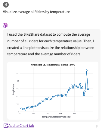
Click Add to Chart tab.
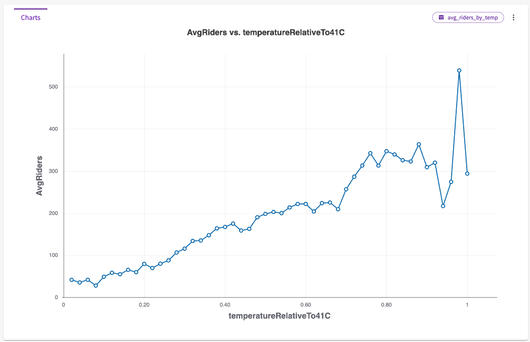
Let's take a look at the underlying dataset that the Data Assistant used to create the chart. Click the dataset name in the top right of the chart, in this case, avg_riders_by_temp.
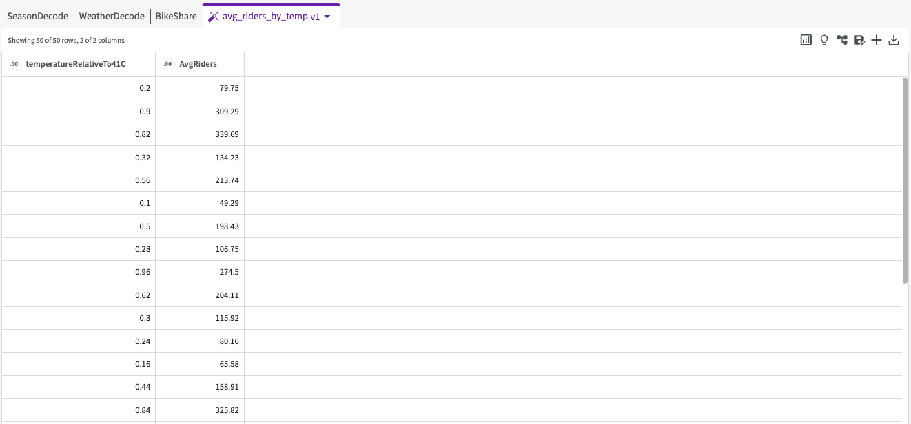
This dataset accurately reflects the values displayed in the chart. Click on the "BikeShare" dataset to bring it back into focus.
Clear the Topic
To ask the Data Assistant a new question, start by clearing the current topic so that previous conversation history doesn't affect the new results. Click the Clear your topic button.

Hide Unneeded Datasets
Before starting a new conversation, let's hide any datasets that aren't needed to keep them out of consideration. Hover over the Data tab, then uncheck "SeasonDecode" and "WeatherDecode" to hide them.
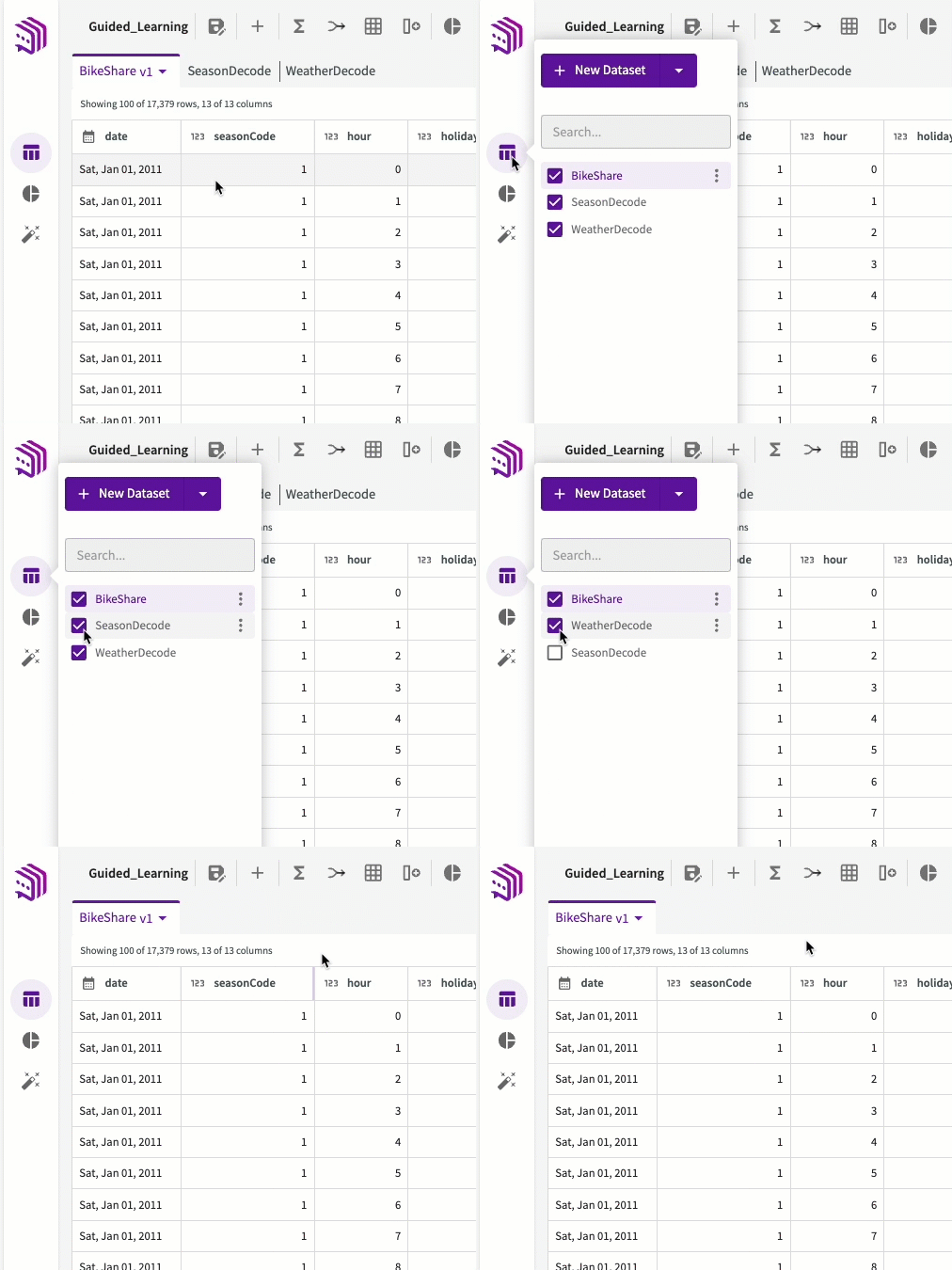
These datasets are now hidden and won't be considered by the Data Assistant.
Machine Learning
With "BikeShare" as our only dataset in consideration, ask "What most impacts allRiders?" The Data Assistant will automatically begin training a machine learning model to determine which factors have the most significant impact on "allRiders". After some time, it will provide a response with multiple visualizations. Click Add to Chart tab to view the results in a larger window:
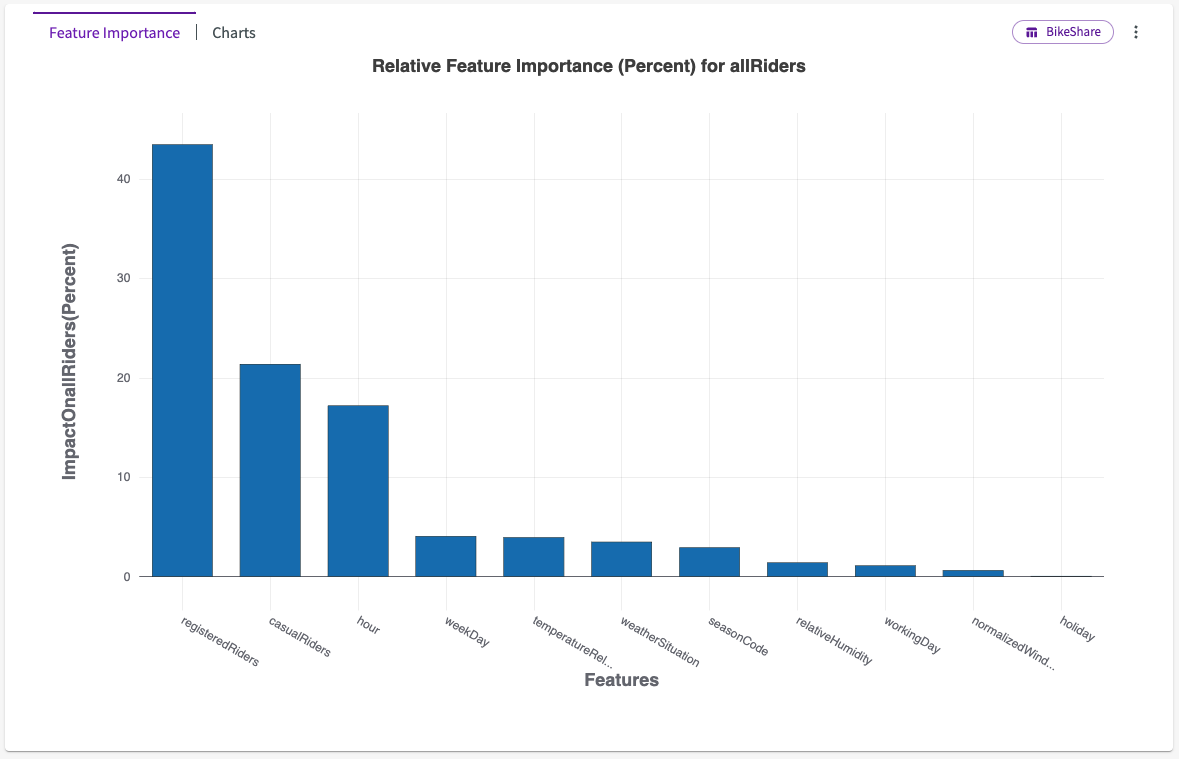
We can see from the feature importance chart that "registeredRiders" and "casualRiders" have the largest impact on all riders, which we expect as those riders are part of the allRiders total. However, we can also see that "hour" also has quite a bit of impact, followed by "temperatureRelativeTo41C and "workingDay".
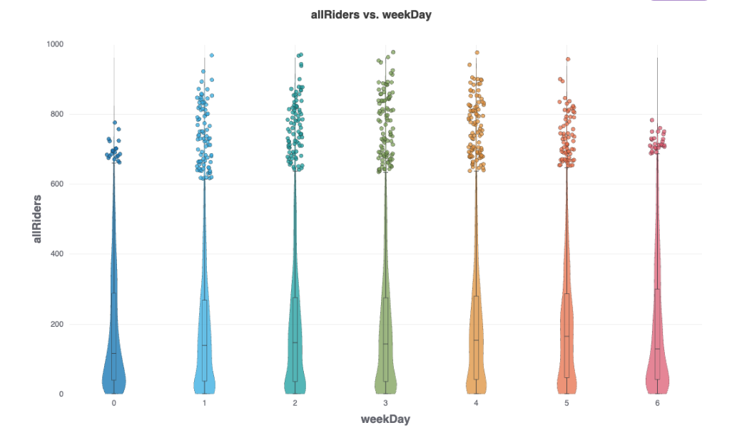
Let's click Charts and select the violin chart, in this case Chart3D. This displays a violin chart that looks at "allRiders" vs. "weekDay". We can see that the most riders tend to ride on the weekend, days 0 and 6, although there is consistent ridership nearly everyday.
